Labeling and packaging for beauty products must offer visual and tactile cues of what the brand promises in order to create consumer awareness and demand for a company’s products. Naturopathica Holistic Health LLC is one such company that faced brand identity issues when it reached its 15th anniversary. After considerable evaluation, the company realized it was not meeting its brand promise to consumers through its existing label and packaging strategy.
The brand promise of Naturopathica is to deliver "A Better Beauty." The company is committed to living and breathing that promise through its Naturopathica product line. Recognized as the first American performance-based natural brand, the company has become an expert resource for championing natural solutions in skin care and beauty products for women and men by integrating centuries-old traditions from around the globe with the latest breakthroughs in science.
The Naturopathica product line is carried by select high-profile spas around the U.S. and sold directly online. And while the brand had built an extremely loyal customer base, it was nonetheless small. So, in an effort to expand, the company felt a re-branding was necessary.
Elixir Design, San Francisco, was given the re-branding assignment, and its first step was to obtain an accurate picture of where the brand stood. The agency’s research uncovered a gap between customers’ brand perception and Naturopathica’s desired brand positioning. The brand lacked customer awareness in a highly competitive market where there are numerous misconceptions about the performance of botanical skin care products.
“The brand was basically flying under the radar,” said Scott Hesselink, senior designer, Elixir Design. “Further compromising the situation was the original packaging and labeling, which were seen as unsophisticated. The labeling was butter-yellow across the entire line. This made it difficult for consumers to delineate products for their skin type. Without strong graphics cues to define the products, shoppers found it hard to navigate the line and figure out what to buy.”
The research findings inspired Naturopathica to make significant changes across the board, from its products to a complete re-branding of its visual image. In an effort to completely leverage its heritage as a performance-based natural brand, Naturopathica reformulated many of its products to earn ECOCERT certification.
The stringent ECOCERT standards verify that a company’s products have been inspected, and that its processes are in conformity with the Natural and Organic Cosmetics standards. The certification involves audit procedures for natural and organic standards encompassing literally every stage and process in getting products to market—from raw materials sourcing to ingredient receipt and storage, formulations to production, packaging to labeling, and environmental stewardship practices to certifying the products, among others.
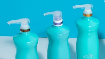
In addition to the new ECOCERT certification, Naturopathica relaunched its products in an eye-catching blue hue.
“A key visual element throughout the full Naturopathica line is our new signature blue color for all containers,” said Beth Stewart, VP business and brand manager, Naturopathica. “We updated and modernized the color we had been using, which enabled us to weave a heritage element into the re-branding. The new custom color match is used in all our labeled tubes, pump bottles and jars. The color and its consistency create an incredibly strong visual platform across the entire line. It’s an anchor point for the brand identity.”
The signature blue also figures prominently in the men’s line, with labels and folding cartons sporting white copy over container-matching midnight blue. Labeling for the women’s line features light-blue labels and unit cartons for face care, including white bars with black text that indicate skin type. The body care line supports its main ingredient with the image of a botanical.
“Color is such a key component of our identity,” Stewart said. “The new look is modern and sophisticated, and also does a nice job of providing a heritage feel.”
Another key element of the re-branding was the switch to tubes made of 30% post-consumer waste, while eliminating the unit carton. This was a significant departure because several of its products were available in aluminum tubes and packaged in unit cartons, which carried additional product information. The elimination of Naturopathica’s unit carton for the tubes didn’t pose any initial design problems for the domestic market. However, Hesselink quickly learned that if the products were to be distributed and sold in the European Union, the copy needed to be in both English and French.
“We thought it was going to be a domestic-only application,” Hesselink said. “Distribution throughout the European Union is great for the company, but the ECOCERT certification requires all copy to be in English and French. So naturally, we recognized that there wasn’t going to be enough room for all the copy, which put the brand strategy at risk of being fully realized.”
In order to meet the ECOCERT multi-language requirement, the solution for Naturopathica was the patented FlexVision extended-text label from WS Packaging Group and its MultiVision label line. The label features a patented multi-ply construction that is 100% conformable and engineered specifically for plastic tubes.
The FlexVision label stock is a 3-mL polyolefin Fasson brand pressure-sensitive film from Avery Dennison and a perfect solution for the 12 separate tube SKUs in 5-ounce and 2-ounce sizes. The labels are completely water-resistant, tested to reseal multiple times without compromising label integrity, and have a shelf life of at least two years. Flexographically printed using five ink stations, WS Packaging produced the labels at its facility in Fullerton, Calif.
“The extended-text label gave us a lot of variety because it really opened up the design palette with the additional space,” Hesselink said. “It allowed us to keep the design standards intact for the prime label but provided ample room for the ECOCERT copy requirements. We were able to deliver on all the messaging needs without compromising the design.”
“Not only did we produce visually stimulating extended-text labels with shelf appeal that supports the holistic health brand strategy, we also consistently matched the custom blue hues for the prime labels with digital printing,” said Paulette Gramse, MultiVision product development manager. “The folding cartons were printed lithographically on materials made from 100 percent recycled fibers with a minimum of 35% post-consumer waste.”
Initial line trials for the new extended-text labels were challenging. The tubes were ECOCERT-certified for direct product contact. Unfortunately, the colorant and post-consumer material in the tubes reacted differently with the adhesive. The label size was modified to eliminate pressure points to aid lay-down with the rigid tube.
“We worked very closely with the label decorator and the fillers to find a successful solution for everyone,” Gramse said. “There was no pressure-sensitive standard for this type of tube, so there was a lot of testing involved in establishing a new benchmark.”
“The extended-text labels are pretty amazing,” said Kimberly Covert, purchasing and fulfillment manager, Naturopathica. “The tubes stand out on their own, but are unmistakably part of the whole product line. The signature blue tube color remains prominent. We just can’t imagine going any other way.”
The re-branding has involved nearly 100 products. Naturopathica began rolling out the new ECOCERT-certified product line in the first quarter of 2010.
John Giesfeldt is a freelance writer, Directions Inc.