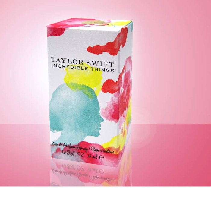
As Pantone's 2016 colors of the year "Rose Quartz" and "Serenity" convey messages of well-being and tranquility, market research firm Mintel predicts more brands may choose watercolor designs in packaging in 2016.
"As consumers seek to achieve balance, well-being and healthy looks from their beauty and personal care products, the 2016 Pantone colors Rose Quartz and Serenity might be the perfect combination to convey this message," according to Mintel's global packaging analyst Viktorija Gnatoka.
Giffarine's Active Young Compact Foundation, Banks & Co's Green Pear & Guava Hand and Nail Cream, and Clairol's Herbal Essences Hello Hydration Shampoo were cited as examples of this well-being and tranquility sentiment. Colour Prevails is another company that uses watercolors in packaging for its color cosmetics, positioning its approach to beauty as a more artistic one, the analyst noted.
Another packaging company on the watercolor trend, Diamond Packaging, received acclaim last year for its Taylor Swift fragrance carton, which was decorated with a watercolor print of Taylor’s silhouette profile. And most recently, Sephora released its Pantone Color of the Year 2016 Collection complete with an arty-packaged Color of the Year Modern Watercolors Eye Palette.
Color blurring of Rose Quartz and Serenity
"Joined together, these two colors embrace the warmer rose tone and the cooler tranquil blue. Color blurring will offer inspiration for novel package designs or new variations of existing designs such as watercolors. Rose Quartz and Serenity are likely to fit with many natural products that want to express product attributes through modern package designs and stand out on shelf," Gnatoka added.
