This article originally in the September 2011 issue of Perfumer & Flavorist magazine. All rights reserved.
Inspiration for new fragrances can come from anywhere, and building off one of the most popular scent inspiration notes, drom Fragrances recently collaborated with The Color Association of the United States to develop fragrances to match with the association’s spring/summer 2013 color forecast. The Color Association, whose forecasts encompass color trends for the fashion and color cosmetics industries, built four distinct color stories—one blue-based, one with warm autumnal colors, one offering bright, vivid hues, and one featuring a lighter, purple-tinged palette—and then worked with drom to create the associated scents.
“They were interested to know how we would design these fragrances based on the storyboards that they came up with,” says drom marketing manager Renato Roque. “So we met, and they showed us the boards, which included the different colors and photos of things in nature and materials that inspired their trend reports, and we ran with the fragrance development from there.”
In the autumnally hued board, perfumer Barbara Wittig found themes of rebirth and renewal, designing a fragrance featuring woody, leathery notes with a sandalwood background. Hoping the scent brings to mind such warm colors as terracotta and gold, it was dubbed Against the Grain.
The scent Haze, developed by perfumer Jean-Claude Delville, used the lighter palette as its inspiration, focusing on the purple tones and bringing this out in the fragrance with darker patchouli notes mixed with hints of powder and violet orchid.
Perfumer Philippe Romano had bright, sheer colors displayed on the board that served as the inspiration for his Jellies fragrance. The scent includes notes of cassis and blood orange for a juicy, jellylike experience and is meant to be layered and customized.
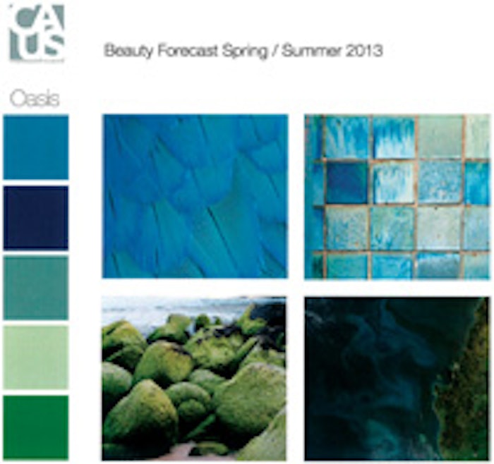
And perfumer Kevin Verspoor worked to develop the fragrance Oasis based on the blue-hued storyboard (pictured). “It included photos of these beautiful, layered blue feathers, rocks by the ocean with algae on them, a collection of differently shaded blue tiles and an aerial photo of where the land and the ocean meet,” he explains. “The board helps provide the inspiration through not just the colors, but also the textures and all the other senses coming together.” After seeing the board, Verspoor used a fragrance he had already been developing in his mind as a launching point for this new aquatic, ozonic scent. “I had been working on a kind of a watery, green, fresh type of fragrance that just smelled modern, and when I saw those blue and green colors, in my head, the color cues and scents just clicked,” he says. In developing Oasis, which is also described as a melding of salty ocean spray and mossy algae, Verspoor says, “This project was very conceptual, and that kind of project is always really fun because it lets the perfumer go wherever they want to go with the fragrance. There really weren’t any restrictions in the form of price or regulatory or any limiting demands, so it was really a chance to be expressive.” However, in application, Verspoor notes Oasis could be used in any number of ways. “It could be more refined as a fine fragrance, or reworked into a scent that could be used in the diffuser/candle environment,” he says. “It certainly has more than one niche it could fit into.”
The real reward of the project’s outcome for Verspoor, however, was the chance to flex his perfuming skills. “Being able to connect the smell of the fragrance with the visual of the color and the touch of the textures and the sounds helped it to be a nicely structured project for me. I think it’s good these kinds of exercises are done, and I think there should be more of them, because it’s about being able to connect all of the senses. People think that all your senses work independently, but until you really think about it, you never realize how interconnected they all are. They operate in conjunction with each other and flow into each other, and projects like this really help us experience and express that.”


