Beauty packaging is setting the standard for most retail brand packaging design, even where the product is not necessarily beauty-related. With a focus on aesthetics, the beauty industry has greatly impacted the visceral draw of products, especially for those brands that are more geared toward the female consumer.
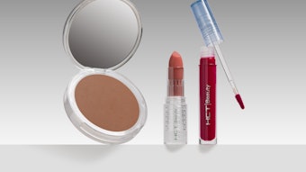
A case in point, Hustler designed its new adult toy line and packaging with a cosmetic sensibility, giving the once dated and explicit brand a much needed face-lift with a chic and accessible new look. Hustler made its product packaging stylish and mainstream, while still maintaining the core brand’s rebellious reputation.
The products are marketed more as necessary luxuries rather than taboo items people should feel shy about. It was important for the packaging to reflect beauty and elegance, while steering away from nudity or explicit language.
Now, the packaging features an altogether new product personality unlike any other product in its industry. Hustler suggests a pleasure workout, listing the calories per hour that each activity might burn.
Three separate collections were created for the line: Beginner, Intermediate and Professional. This would make the products feel less daunting to those new to this category of products, while encouraging exploration for those with more experience. In addition, retailers could choose to feature all three collections or select lines that were more appropriate for their consumer base. The products themselves were inspired by the latest trends, colors and industry innovations. With a selected color palette ranging from blues to purples, pinks and reds, the brand would feel bold yet playful. Just like a woman might select a lipstick shade based on her mood, a woman could also choose a product color that reflected her mood. Customers are encouraged to mix, match, accessorize and create custom sets based on their color/mood choice.
Black and silver were the primary colors used in the packaging, giving it a clean and stylish feel. The line features different types of packaging depending on the product. The higher priced items or those with accessories and additional parts were packaged in streamlined boxes with a semi-translucent cover so the product could be easily viewed.
The basic and more moderately priced items were packaged in thick plastic zip-top bags for hang display. This would drive impulse purchasing, encouraging customers to buy the same product in multiple colors.
Since its launch, the line has been very successful and has even started new industry trends. The brand’s tagline continues to “convert” new members everyday: “Be adventurous, feel liberated and relax, it’s just sex.”
Los Angeles-based startup Echo Beverages also took cues from the simple elegance of beauty packaging to drive its brand identity. Echo is positioned as an environmentally responsible bottled water company with a focus on local production and distribution, featuring 100% recyclable bottles made from 100% recycled plastic. The packaging had to mesh with the company’s staunch eco-responsible philosophy.
The logo, bottles and all corresponding packing were designed with simplicity in mind. In addition to conveying the company’s philosophy, the bottle had to also sell the product itself, amid shelves of bottled water competitors. Featuring a slim label and nothing else, the bottle’s sheer simplicity allows it to stand out. Clean, modern and responsible, the blue and green color palette evokes the purity of the water, while the design of the packaging also keeps waste to an absolute minimum. The removable label was designed to save time and effort at recycling facilities, and the brand encourages the consumer to peel the easily removable label before putting the bottle in a recycling bin.
The labels were printed in a carbon neutral, FSC-certified, 100% wind-powered facility. The name of the brand, like the arrows in the logo emphasize how efficiently Echo uses all of its resources. The brand’s tagline itself states Echo is “simple, local and responsibly packaged.”
Since Echo’s launch, it has seen much success throughout all of Los Angeles, including being picked up by Whole Foods Markets. As for the beauty industry itself, there is a growing importance placed on the packaging to drive the brand, as well as consideration of the materials used to create the packaging. Coola Suncare, a San Diego-based company, launched a sun protection line positioned as all natural, organic and cruelty-free in 2002, and recently released its newest line, Environmental Repair Plus—comprised of three products designed to reverse the damage caused not just by the sun, but also by other environmental stressors such as pollutants, toxins and dust.
To communicate the purity of the product line, the packaging was designed to showcase simplicity. Featuring a pure white box with green accent, each product highlights an image of one of the showcased ingredients. For example, Calm Glow Eye Gel shows three delicate pink rose petals representing the rose flower water ingredient utilized to help soothe and tone delicate skin around eyes. The Fresh Relief Face Serum features an image of green alfalfa sprouts, an extract used to fight wrinkles and improve skin’s elasticity and collagen production.
As the products themselves are eco-consciously developed and produced, the packaging materials, inks and their production had to follow suit. All of the packaging is made from recycled paper and is 100% recyclable. In addition, all of the products are created at the company’s solar-powered lab.
As packaging plays an increasingly vital role in brand development, there is a shift toward more aesthetic creativity, as well as an emergence of more eco-friendly packaging materials and production. Reinforcing a brand’s philosophy through packaging gives consumers a more practical understanding of the product and the brand, therefore greatly increasing the chances of the company’s success in an exceedingly competitive market.
A graduate of Art Center Pasadena and founder of Ferroconcrete, Yolanda “Yo” Santosa began her career designing main titles for film and television projects such as 300, Desperate Housewives and Ugly Betty. Her love of storytelling grew into a fascination for branding, leading her to develop Ferroconcrete as a unique, full-service branding and motion design firm. She also is the creator of her own retail brand—früute (www.fruute.com), a contemporary West Hollywood pastry shop serving handcrafted mini tarts. She has earned three Emmy nominations and is a national guest speaker and branding expert.