When designing packaging, one of the most basic and important considerations is whether the product pops out compared to its neighbors on the shelf. Since we are all consumers, everyone has had the experience of shopping in a store and seeing that one product that separates from the pack and makes us want to pick it up. But do we ever stop to think about why that happens? Is it a calculated decision or a subconscious impulse?
Packaging is one of the most important brand touch points, as it is typically the first thing a consumer interacts with in a brand experience. In fact, packaging can be the sole influencer in a consumer’s purchase decision. For this reason, even small companies will often invest heavily in their product packaging when compared to other parts of a brand campaign.
The strongest packages are authentic expressions of the brand personality and speak clearly to the audience or consumer. This is key to the target customer picking up a package and feeling as if it is speaking directly to him or her. Especially in today’s high-speed world, people have so many choices and so little time to make purchase decisions. For this reason, a strong initial impact on the shelf is that much more important.
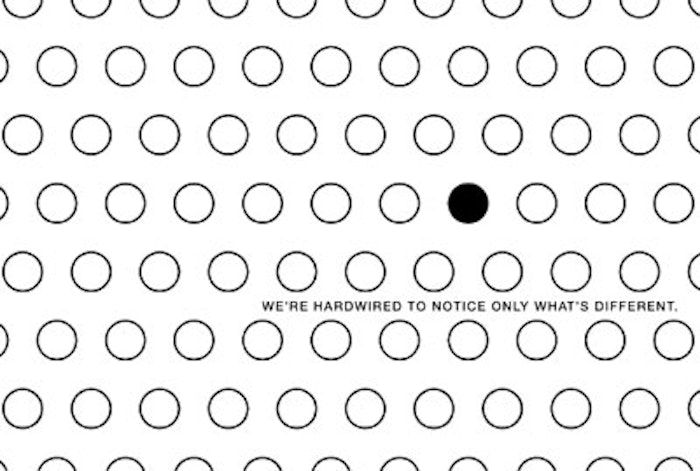
But what makes a package have the visual power to get someone’s attention? Even going back to design school, one of the first things I remember learning is that people are wired to notice what is different when looking at a grouping of objects. This principle applies to all aspects of a design, whether it’s the shape, color or content of the design. Designing a product package that stands out is ultimately achieved through a packaging identity that is honest and targeted—an identity that no other competitors can claim. Simply being different for the sake of being different isn’t enough—in fact, it can come off as a gimmick to today’s sophisticated consumer. It’s important to keep in mind that a brand is not the product, or even the package that presents the product. It is the visceral reaction a person has to that product and the public perception of the company behind it.
Because being authentically different is the key to standing out from the competition, it is critical to analyze what the competitors are doing and saying in order to find a unique, ownable niche. Not only is it critical to study packaging identity trends, it is also critical to look at factors such as messaging trends and structural packaging trends. Only with a thorough analysis will it be clear if a packaging identity is truly unique in its form, brand identity and messaging. Once a competitive audit is conducted and a solid strategy is developed, it is easier to make an impact with unexpected packaging approaches without feeling contrived.
Communicating a unique brand identity on a package design can be expressed through the visual form of the package, or the graphic design, the verbal communication or the copy writing, and the tactility of the package, or the shape and material. Unique form or overall design aesthetic, regardless of trends in the marketplace, can give the packaging that extra edge in standing out on the shelf.
Unique packaging forms are particularly important for female-targeted brands, as women are sensorial in nature. Trends come and go quickly, so the most important thing to remember when considering a new package design is to stay true to the core values of the company and the characteristics of the product itself.
Although there is no clear formula to designing unique packaging, there are some fundamental principles to remember when embarking on a rebrand. Below are just a few tips along with examples of successful brands that have implemented packaging that truly stands out in the marketplace.
Tip #1: The Boldest Design Isn’t Necessarily the Strongest
When trying to lead their brands to be unique, many brand owners make the mistake of trying to make the product pop too literally. But in many cases, the loudest or most elaborate package design isn’t the one that stands out. This is why it is so critical to analyze the competitive landscape. For example, if all the products in the category or on the shelf around your product are bold, your bold package is going to get lost in the sea of sameness no matter how impactful it may be on its own.
Apple is one of the best examples of a successful brand in today’s marketplace. The entire brand experience—from the packaging to the website to the in-store environments—is smart, beautiful, and communicates a strong and consistent message. The packaging is artfully designed with clever structure and high quality construction, forming a direct connection to the characteristics of the product itself. The packaging is known for being incredibly simple and clever, with almost no color and restrained typography. In this case, the most minimal package is the one that stands out in the category. Over the years, many competitors have been trying to mimic this aesthetic, but because Apple was the first to break through with the powerful minimal approach, the competitor’s versions almost always look like knockoffs. Because Apple has been so consistent in its approach, it now owns the clean and minimal packaging approach in the electronics category.
Tip #2: Stock Components Can Be Interesting When Taken Out of Context
With the sea of sameness, customers are used to seeing the same stock packages out there with different labels slapped on to them. For small- to mid-sized companies, going custom often isn’t an option due to lower quantities and the cost involved with doing custom packaging design. But the good news is that stock components can be unique, especially when used out of context.
Premium bath and body line Cucina (“kitchen” in Italian) does a great job of using unexpected components to communicate its brand message. Instead of the typical stock components used in beauty packaging, it utilizes bottles that mimic food bottles such as olive oil and jam, and cartons that reference items such as cheese and canned goods. Since the name and packaging identity is inspired by an Italian kitchen, using food packaging is a clever twist that helps to support the brand identity. Taking components out of context can be powerful as long as it works conceptually, as in this example. If done arbitrarily, it can easily look odd or hokey.
Tip #3: Go Custom for the Most Differentiation
With so many brands trying desperately to be noticed, it is important to design packaging that is innovative in its form whenever possible. Since we see form first in the sequence of visual perception, a unique shape can be key in catching a customer’s eye quickly and standing out on the shelf. Over time, the shape itself can be just as ownable as a logo mark or a brand color.
Method is one of the most prominent examples of brand packaging that is known for its unique forms. When it first introduced its “drop” packaging for its soap pumps, there was an immediate splash in the market that helped to propel Method into huge success and name recognition.
The most successful unique packages are often the first in their category that use a particular form or technique—when other brands follow, it almost always looks like a copy and the consumer will ultimately think of the original anyhow. Since Method was the first to execute this distinct packaging form in its category, it now owns any form that looks even remotely similar, and competitors that try to ride the fad end up looking like knockoffs.
Method has continued its unique and award-winning packaging since the success of the signature soap pump product, and still uses unique forms as a core identifier and differentiator. When combined with clean, minimal label design and clever copy, this aesthetic works seamlessly for Method—as it was an honest communication of the product: clean, innovative, and fresh personal care and cleaning products.
Aniko Hill is the creative director of The Kitchen Collaborative, which she founded with a determination to innovate the traditional creative business methodology. Her distinct creative and professional vision has produced award-winning work with quantifiable results for clients in categories including health & beauty, fashion, home products and pet care. Her work creating premium lifestyle brands for the sophisticated female market has been featured in top industry publications such as Print, CPC Packaging and HOW magazines. Hill is also an expert editorial contributor, writing for trade publications such as GCI, Package Design and Beauty Packaging magazines. Graphic Design USA recognized Hill as one of the People to Watch in 2008.