The beauty industry is constantly going through cycles in the appearance, naming and messaging of brands. Although the best branding campaigns transcend fashion or trends, it is vital to be aware of fads as part of the brand development process in order to stay current and differentiate a company in the marketplace. In analyzing trends in the beauty industry, packaging is a great place to start because even smaller companies will often invest heavily in their product packaging when compared to other aspects of a brand campaign. Packaging is typically the first brand touch point a consumer interacts with, and can often influence the purchase decision.
As long as a package design is an authentic expression of the product or service, falling within a trend can be a positive thing for the company, as being in vogue may be very important to consumers in certain categories—i.e., if the brand is cool, the consumer in turn feels cool. As a marketer, you look at current trends as part of your brand strategy work in order to determine how to best differentiate products in the crowded marketplace. But trends do come and go quickly, so the most important thing to remember when considering a new package design is to stay true to the core values of the company and the characteristics of the product itself. The following examples outline just a few current trends that are taking place today in beauty packaging identity.
Trend #1: Studio/Professional Look
With the growing demand for professional beauty products, there has been a boom in the number of brands that are studio- or makeup artist-endorsed. This sub-category has existed for many years, the successful premium professional brand MAC is a notable example, but has more recently made its way into mass distribution outlets. Target now has cosmetics lines developed by celebrity makeup artists such as Sonia Kashuk and Napoleon Perdis that tote some of the same messaging as their more premium counterparts but come in at more affordable price points. Although the professional visual identity trend is most frequently seen in makeup artist-endorsed brands, it can also be seen in other cosmetics, hair care and skin care brands.
The packaging identity is typically a solid black or dark gray color with a clean, white modern type treatment for the brand name and product information. In the logos, there are usually no icons or other embellishments, creating a very stark and intentionally generic look and feel—Smashbox, Lorac, Make Up Forever, Bobbi Brown and NARS all follow this formula for their packaging identities. In this trend, product naming and messaging is traditionally straightforward, but buzzwords such as “high definition” are used in products—note Make Up Forever’s HD Microfinish Powder and Smashbox’s High Definition Healthy FX. Primary packaging components are usually very straightforward and utilitarian, with form following function.
Trend #2: Vintage/Whimsical
A growing trend in beauty packaging today is a vintage-themed identity, combining fun graphics with tongue-in-cheek copy. Many of these packaging identities feature retro colors and typography referencing the 1950s and ᾽60s and use vintage pin-up illustrations. Illustrations of bombshell women are seen on packaging for cosmetic products such as Bare Escentuals’s Buxom Babes line and The Balm’s Hot Mama. In fragrance, Jean Paul Gaultier’s iconic bottle in the shape of a curvy female figure is reminiscent of the 1950s female form. Although not all packages within this trend utilize a combination of image and naming, these whimsical identities are most effective when clever copy and visuals work together in harmony. For example, Benefit’s Dr. Feelgood and Talk to the Tan both create a clever and strong connection between the naming and imagery.
Some brands fall within the vintage or whimsical packaging identity trend for a product or sub-brand within their line, while others have made this look an integral part of their overall brand. Benefit Cosmetics has consistently used the connection between clever copy and visuals for a fun and vibrant brand experience. In addition to the images of pin-up women and mannequins, Benefit expands on the vintage theme through images of mid-century superhero cartoons, late 19th century medicinal packaging and even 1980s airbrush-style imagery. Illustrations are always paired with appropriate product naming and copy, creating a look and feel referencing the era being portrayed and an overall fun and spunky brand personality.
Trend #3: Regal
Packaging with an overall regal or luxurious look is another common trend found in beauty today. This look is sometimes achieved with graphics alone through the use of detailed French-inspired patterns and framed decorative elements reminiscent of royal seals, usually executed through a symmetrical design. Color palettes are typically rich, with jewel tones used as the most common palettes. Too Faced’s Lash Injection Antidote utilizes regal elements with a simple and inexpensive graphic label, but creates a twist on the theme with a fresh and modern color palette. Script logo and copy fonts are also seen in this trend, lending an additional touch of formality. Extra touches such as tassels, ribbons, raised metal and jeweled embellishments are also seen in product packaging within this trend. For example, Guerlain’s Kohl Kajal Eyeliner has silk ribbon at each end for an extra touch of luxury, and True Religion’s eau de parfum spray has a raised decorative design with a rhinestone embedded into the package.
Juicy Couture has been on the forefront of this look for more than 10 years, beginning in fashion with their signature velour track suits and more recently expanding into beauty. Juicy’s iconic logo seal—containing two Scottie dogs, two Js and a crown—is framed with a ribbon containing the brand name. The juxtaposition of these offbeat elements executed in a classic style is a modern twist on a traditional regal seal. Juicy consistently executes its regal look through its graphics, photography and fabrics, creating a meaningful brand experience regardless of the trend.
Trend #4: Cosmetic As Accessory
One of the most important parts to creating a successful consumer lifestyle brand is to create a relationship where the consumer is proud to identify with the brand. Beauty companies seem to understand this concept, and many are creating products that either look like a fashion accessory or have a keepsake attached to the package. Both concepts create a lasting brand identity—the idea is customers will show loyalty to the brand through proudly carrying these pieces with them just as they would any other accessory.
Many of the cosmetics packages that illustrate this trend are bejeweled or leather-stitched for a beauty product that looks like a woman’s accessory. For example, Dior’s Lady Dior compact features embossed and stitched faux leather and sparkling metal, and even has handles and charms to resemble a real handbag. Tarte’s Eye Couture Day to Night Palette is executed with a cross-stitched faux leather and a flap to resemble a clutch purse. Typically, products with this extra attention to fashion, and its added production costs, are seen on items that are made to last longer and for the consumer to carry on-the-go, such as an eye makeup palette or a brush kit.
In addition to designing packages to look like accessories, brands are also utilizing keepsake items attached to a more typical cosmetic package that serves as a bonus for purchasing the product. For example, in MAC’s new Hello Kitty Kouture collection, the lip gloss component sports a silver chain pendant featuring the character outlined in Swarovski crystals. This trend is seen in fragrance products as well—Clinique’s Happy has a floral pendant attached to the neck of the bottle, Juicy Couture has a gold chain and charms with elements of its brand identity, and Still by Jennifer Lopez has an imitation diamond ring integrated into the neck of the bottle. These take-away accessories make the product feel more special and remind the consumer about the brand—even after the life of the product.
Trend #5: Eco-friendly
With the recent rise in public awareness of environmental issues, it is impossible to ignore the trend of eco-friendly packaging in almost all industries. In the beauty industry, Cargo has been one of the leaders in innovating eco-friendly packaging. For its Oil Free Foundation, Cargo utilizes a lightweight squeezable pouch usually seen in less glamorous product categories. In addition to using less plastic, the pouch allows the user to access every last drop of the product, while also being hygienic and portable. Cargo’s Plant Love lipstick tube is 100% biodegradable and made entirely from corn-based PLA. The outer carton is made with biodegradable flower paper, and filled with real flower seeds that the consumer can actually plant.
In addition to using eco-friendly materials, companies are also rethinking the way their products are used and reused. Make-up designory’s empty palettes are constructed from paper, and are magnetized to hold eye and cheek color tins in place—eliminating extra plastic involved with single color containers and allowing customization for each customer.
Many of these materials are also seen in the beverage and home product industry, where packaging needs to be recyclable and where shipping weights are also a concern—with an eye toward lessening the company’s carbon footprint. Packaging that utilizes less plastic and features smaller labels to save paper is growing in number. Aquapax, a U.K. water product, and French Rabbit wines are packaged in paper cartons, which are recyclable and use less fuel to transport than glass bottles due to their lighter weight. In the home product category, Method is known as an innovator in this trend, not just through its packaging but with the products themselves. The nature-based, renewable materials are utilized—wipes are even made from bamboo—and lightweight pouches are used whenever possible on refillable items.
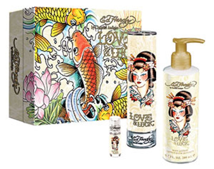
Trend #6: Rock ‘n’ Roll
One of the latest trends in beauty bled over from a trend that has been taking place in fashion for the past few years. With the explosion of rock ‘n’ roll- and tattoo culture-inspired brands such as Ed Hardy, Smet and Affliction, this look has now become an acceptable mainstream trend, and is being utilized in the beauty industry as well. There are several beauty lines with rock ‘n’ roll- or tattoo-inspired content and graphics, with packaging identities that feature hand-drawn typography, gothic black letter fonts and either bright colors or all-black to reference actual tattoo inks. Another visual cue used in this trend is the use of embossed chrome, reminiscent of exclusive fashion jewelry line Chrome Hearts. Rock & Republic, a denim company, recently launched a cosmetics line utilizing the chrome rock n’ roll jewelry aesthetic.
Established brands not previously utilizing designs such as these are picking up on this trend—Smashbox recently launched its Wicked Lovely collection, creating a more overtly edgy look to the products and packaging when compared to the brand’s signature line. In addition to existing beauty brands that are creating rock-inspired products, many of the newer players within this trend have roots in fashion or entertainment. For example, Ed Hardy’s signature images are now also being expanded into skin care and fragrance lines. Tattoo stars are also creating lines to capitalize on this trend. Kat Von D, the lead in the reality series LA Ink, recently launched a line in partnership with Sephora.
Trend #7: How-to Kits
Many cosmetics brands now offer an instructional kit that pairs products together with detailed instructions to create ease and education for the consumer. These kits are often positioned to introduce the consumer to a few products and the brand in hopes of creating future loyalty. The efficiency of the kits and education create an added value and benefit, and kits are often discounted as compared to buying the products a la carte. Bare Escentuals’ Get Started Kits and Too Faced’s Eye Shadow Insurance Policy both illustrate this trend.
In this trend, products are usually paired with printed or video instructions included in the package. Smashbox’s Masters Class has a DVD enclosed to instruct the user in the application of the makeup included in the kit. Look-specific tutorials are also very popular—for example, brands such as Bare Escentuals, Benefit, Cargo and Too Faced all have smoky eye kits. Visually, the packaging identity within this trend usually features photography of a model or an illustration of the part of the face the products address paired with straightforward typography. Color palettes are typically more muted and the product offering is often displayed right on the front of the package.
Trend #8: Cause Packaging
Current research shows that corporate association with a cause is a plus for women when making purchasing decisions—and it’s clear that many beauty brands have taken note. The packaging identity for these cause products usually does not deviate much from a company’s core identity, but is often modified slightly with a color change or a supporting symbol or logo. For example, L’Oréal’s Color of Hope Cosmetics Collection is very similar to the typical L’Oréal branding, but utilizes a hand-inspired treatment of the word “hope” to give the line its own identity. Smashbox’s Pink Power Kit combines a white ribbon with the brand’s logo type treatment and uses a pink background, as opposed to the usual black, fusing the cause and the brand visually.
Many of the causes seen in this trend are female-oriented, but some are not necessarily gender-specific. For example, Make-up designory’s MUDCares Palette donates toward NextAid, an organization helping children in Africa orphaned by AIDS. Kiehl’s World AIDS Day Lip Balm benefits YouthAIDS.
The commonality of the successful package designs across trends remains an authentic expression of the product or service, and serve as apt examples that new package designs, in order to be successful, must stay true to the core values of the company and the characteristics of the product.
Aniko Hill is the founder and creative director of The Kitchen Collaborative, a boutique branding agency that works to create premium lifestyle brands. She has worked on branding projects for Boeing, Disney, Master Foods, Sony, Ketel One Vodka and Red Bull, and has taught advanced courses on branding and packaging design at The Art Institute of California.