- Take a different approach for the brand to stand out in the crowded marketplace.
- In the brand-building process, brand identity usually begins with a logo or brand mark, and also includes supporting elements.
- A successful brand campaign is consistent through all brand touch points.
- Communicating product benefits and quality is not enough—there must be a bigger idea and an artistic expression.
Although there are no rules on how often to update a brand or a perfect moment in a company’s growth for launching a rebrand, there are often signs that it’s time for a change. “Originally we looked for help when we started running into problems with parts of the brand identity and creating a cohesive description of the product line,” says Tate Holland, CEO, Makeup Designory (MUD). “We ultimately decided the best approach would be a cohesive study of the entire brand.”
Since branding is simply the public’s perception of a product or service, it is natural for a brand to change in time as the market or company evolves—or if the overall culture transforms. The decision-makers at MUD understood this concept before any work began. “A company is like a person—it has an infancy, a childhood,” says Holland. “As the entity grows and develops, there are natural things that are happening. One needs to be aware and incorporate the changes to grow at a steady pace.”
An Ownable Niche
MUD already had a solid business as a well-known makeup school and trusted cosmetics line within the professional makeup market when work on its rebrand first began. However, its presence in the general cosmetics marketplace had yet to be established. And the beauty marketplace was already flooded with brands—notably MAC, Smashbox, Lorac and Laura Mercier—that took an “expert” positioning. Because MUD was using similar messaging, it was time to take a different approach for the brand to stand out in the crowded marketplace.
The first step to rebranding was to analyze competitive messaging and trends in order to find areas of opportunity within the marketplace. It was found that, although many competitors took a professional approach to their brand positioning, none owned education. With MUD’s reputation as a prestigious makeup school, it was a natural area of opportunity.
Consumer research found that although makeup buyers were women of all ages, the baby boomer market was the most natural fit for MUD’s primary target market due to shared values—most notably, the consumer’s willingness to be educated on makeup techniques. The findings became the foundation for creating a unique, ownable niche for MUD.
“We have come to the notion that we are now going after a particular segment of the market,” says Holland. “This continues to be something we have to remind ourselves of. When you define your market, you are now able to define new product development under those parameters.”
A Unique Identity Problem
In the brand-building process, brand identity usually begins with a logo or brand mark but also includes supporting elements, such as color palettes and taglines. When done well, brand identity should constantly remind the customer of the meaning of the brand. Although the company’s name is Makeup Designory, the brand had come to be known as MUD due to the public’s tendency to use acronyms when referring to educational institutions. However, since MUD was not the legal name of the company, this had to be a consideration in the identity exploration process.
To address this concern, alternate naming solutions were explored, along with supporting taglines. Holland says, “Although we ultimately decided not to change our name, the process helped us to look deep and to look at the work we had done so far—and to be confident of maintaining the use of our name.” However, by pairing the existing name with a new tagline—“An Educated Approach to Makeup”—the brand was able to communicate the new brand positioning in a short phrase.
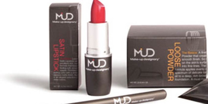
The final solution for the MUD logo utilized the acronym in a modern, iconic word mark with a fusion of all the characters in the name. The continuity of the mark, scalloped edges and accent element were reminiscent of a brush stroke, designed to create a subtle reference to the artistry of makeup. The new mark was paired with the existing type treatment for Makeup Designory, clarifying the confusion between the two names and making for a more seamless brand evolution.
“The new iconic treatment mark allowed us to fully embrace our name in moving forward with the new brand,” says Holland.
Consistent Execution
A successful brand campaign is consistent through all brand touch points—whether a customer is using a product, talking to a service representative or making a purchase on a Web site. Packaging, copywriting, printed collateral, Web sites, environments and photography style must have a consistent voice and tone for a brand campaign to work in harmony.
Integrating MUD’s current primary packaging seamlessly was one of the main challenges in redesigning its packaging. The final solution maintained the MUD gray—which, when used alone, was very similar to competitors, but presented the new educational positioning in a unique package experience when used in conjunction with diagrammatic illustrations and instructive product copy. Clever production concepts—such as inserts, sliding boxes and die cuts—were also explored. “We were fortunate that we were able to maintain the gray, which allowed for an easier introduction of new packaging,” says Holland. “It was easier to integrate the new packaging with our [retail partners].”
In order to further ensure simplicity for the busy lifestyles of target MUD consumers, the line was divided into easy-to-follow categories, such as Face and Eyes, and each product grouping was color-coded for fast recognition on the shelf. The accent element in the logo became a flexible part of the identity that would change when used on different product categories.
The corporate and product brochures utilized the subtle diagrammatic illustrations from the packaging in conjunction with professional tips and tricks, “get this look” instructions and high-design die cuts created to teach the consumer about makeup and for an interactive experience. Authentic, emotional close-up photography of models representing real women created an approachable lifestyle feel, contrasting airbrushed models shown commonly used in the category.
For the interior of the stand-alone MUD retail stores in Los Angeles and New York, there was focus on making the shopping experience as simple as possible through the creation of custom displays that enhanced the color-coded categories of product. Soft white hanging panels diffused the light in the space and created privacy in the makeup stations. Instructional graphics conveyed important product information and useful professional tips and tricks for an added educational experience.
Lasting Results
The key to successful long-term lifestyle branding is creating an emotional connection to the market. Communicating product benefits and quality is not enough—there must be a bigger idea and an artistic expression to create the indescribable emotional connection that makes a person loyal to a brand.
MUD continues to work toward nurturing this connection, and has already seen the effects of the new brand positioning with its existing retail partners. “They love the education, and they see the tie-in across the board,” says Holland. “We’re being asked for the new materials that incorporate the bits of education to help sell our product within their stores.” MUD has also noticed changes in how it is perceived by potential customers. “You’re taken far more seriously,” says Holland.
Internally, the brand-building process, along with structural refinements MUD enacted concurrently, has also helped to keep everyone in the company on the same page.
Aniko Hill is the founder and creative director of The Kitchen Collaborative, a boutique branding agency that works to create premium lifestyle brands. She has worked on branding projects for Boeing, Disney, Master Foods, Sony, Ketel One Vodka and Red Bull, and has taught advanced courses on branding and packaging design at The Art Institute of California.