- In order to translate a color concept into a successful plastic bottle, color must be defined by characteristics, each separated into chemistry that works with the layers to be built.
- One of the most difficult things we do is interpret an idea of a color.
- The success of a color in packaging comes down to a visual impression that leads to success of the brand.
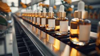
The rate of very cool looking plastic bottles, with a rainbow of amazing colors and effects, hitting the shelves seems to be on a constant rise. It’s a scenario written about in these pages monthly. There are more and more brands with growing lines competing for less shelf space and less consumer cash. Though it’s easy to appreciate brand and supplier efforts realized in finished bottles, it’s also easy to take the importance of color and effects, and their impact on brand success, for granted. GCI magazine had a chance to spend a day working with Clariant ColorWorks at its McHenry, Illinois facility on a faux project, creating bottle colors (really, brand identity) for an imaginary shampoo and conditioner line.
Let’s Begin
Len Kulka, director, creative development, consumer packaging, ColorWorks, Clariant Masterbatches, and his team took on the challenge of creating brand impact through color and effect based on a favorite pair of shoes. Sounds weird, right? But these kind of inspirations happen all the time, and have led to some pretty successful brands. So, GCI magazine’s Kim Jednachowski offered up her favorite flats, and Kulka and team got to work.
To take full advantage of the visit, staff members sent Pantone reference color numbers ahead of time. Typically, brand owners and their design teams begin their work with ColorWorks by going through a color library and exploring color trend forecasts. But by the time we arrived on-site, work was underway.
Kulka had created a project name, Twitter Me, for an imaginary hair care brand—Timeless Radiance. The project brief noted that the shampoo and conditioner were for an upscale market, and intended to be a “friendly” option for colored hair. It was important that the color conveyed luxury and communicated an upscale impression on shelf.
The First Iteration
ColorWorks molds bottle samples in a modified Boston round shape. Its simple, concentric design virtually eliminates color variations related to the bottle shape and allows brand owners to concentrate on color, effects, opacity, etc., without getting hung up on aspects such as shape.
“The customer sees color in the mind’s eye, but what we want to do is define color by its characteristics and then bring those characteristics into chemistry that works in each layer of the structure,” says Kulka.
It is also, then, important for the color experts to understand and be able to explain what happens to color (or the perception of that color) as it translates from the mind’s eye—or pair of shoes, in this case—to the bottle. And when the first Timeless Radiance shampoo bottle comes off the mold, customer Jednachowski is not thrilled. The color matches the Pantone sample and the shoes, but it doesn’t translate to the bottle. The luster and gloss of the shoes, something the customer took for granted as an element of the color, wasn’t there in the first bottle iteration. This was the first lesson: expressing details, desires that influenced the attraction to the color but wasn’t necessarily the “color.”
“It’s a physical manifestation of color. One of the most difficult things we do is interpret an idea of a color. Your interpretation of the color and my interpretation of the color are clearly different,” says Philip Ksiazek, color development specialist. This, too, was a good jumping off point to talk about materials, layers of a bottle, balance of color and the impact on the overall color.
Materials, particularly PCR, can impact the visual aspects of a package in a negative way. Yet, when included as a component of the “background” in the layer structure of the bottle, these same materials contribute to the overall color creativity, and can be used to help control the brightness or darkness of the color contrast in a container.
“Any mixture of PCR, trim scrap and virgin resin isn’t pristine—and is somewhat dingy,” says Kulka. “We want to move that mix into the inner layer where it actually contributes to the opacity and color strength. In effect, it becomes our background, a functional ‘primer,’ and once we can pull it into the customer’s desired range of color, it becomes a positive component in the overall structure. Then we can come over the top with an outside layer that’s clean and brilliant. All pigments that have great reflectivity [such as pearlescents] are moved into the outside layer. The result is that the two layers work together to create a look that can’t easily be achieved in a single layer, and we can still use the PCR that is such a high priority for the big-box retailers.”
At the same time that the bottles were being produced and those colors evaluated, polypropylene (PP) overcaps were being produced for evaluation with both bottles. The first caps produced were dark brown, intended to complement the bottles, but customer Jednachowski was blunt: “I don’t like brown.”
It’s About the Brand, Not the Color
Something happens along this journey. As the iterations of bottles progress (see Project “Twitter Me” Technical Specifications), the discussions about color are no longer really about a “color.” The discussions become “What color is really saying about my brand, and what brings these bottles and caps together to communicate a message.” “All we’re doing is creating an easel and we’re putting a picture over the top,” says Kulka. “It’s the visual impression—that’s what it comes down to.”
The GCI magazine group’s requests for changes are met by the ColorWorks team, and options begin to emerge. We’ve moved away from looking for the “perfect” color, and have begun to explore complementary colors and colors that tell a story. It’s true that the bottles become more and more beautiful as the technicians work their magic—tweaking, looking for specific glows and highlights, and the working toward that “pop” to make the brand jump off the shelf.
When we’ve gotten to a point in which the bottles shimmer, that brown cap dismissed earlier in the day (and nearly supplanted by caps that were deemed attractive solely based on their color and not their role in the brand) is seen to clearly tie a line together. They’re not simply capping the bottles, they “cap” the brand.
Special thanks to Clariant ColorWorks for its time and for sharing project notes.
The Color/Effect Iterations
The Bottles
Red Bottle #1 (first iteration, shown on far left): Pantone 491C was used as a color starting point. For the bottle, the color was created using a combination of red, brown and black pigments to create a red-shaded brown that was used in the base layer. In the surface layer, a small amount of red pearl was added to heighten gloss and reflectivity. Although the color matched the initial reference (the shoes), this bottle was deemed “too brown.”
Red Bottle #2: The level of red was increased and the level of brown used in both layers was decreased, while keeping the black loading the same as #1. The amount of red pearl in the surface layer was increased by a factor of 2.5. This bottle was “better, but still too brown.”
Red Bottle #3: The level of red was increased by 40%, and brown was reduced by 50%, while keeping the black loading the same. This color was again used in both layers, and the red pearl in the surface layer was increased by a factor of 4.5 over #2. This bottle was “really getting there.”
Red Bottle #4: Technicians switched to a different red (a blue-shade red) in both layers, and brown was eliminated completely while the black and the pearl loading remained the same.
Red Bottle #5: The only difference in this bottle versus #4 was a switch to a different, high-intensity red pearl. The result was “very good just a bit too yellow.” Red Bottle #6: Blue was added to the formulation used in #5, which decreased the yellow and made the whole effect deeper and richer. This was the final formulation chosen for the shampoo bottle.
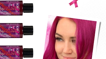
Pink Bottle #1: (not pictured) Pantone 493C was used as a color reference. The outer layer combined white and red with a silver pearl, while the base layer used the same white and red but no silver. Color loading in the base was higher overall in order to mask the shade variation of the postconsumer resin. This effect was “nice, but a bit dull.”
Pink Bottle #2: (not pictured) The formulation of the outer layer was changed to reduce white by one-third and reduce the red by 10%. A white pearl was added—along with a small amount of red-copper pearl to tone the flash (the light reflected off the bottle) toward pink and to warm the color. The inner layer remained the same. Ddecreasing the color loading in the surface layer had the effect of moving pigment out of the outer layer so that the color strength comes out of the inner layer. More clarity in the surface layer allowed light to work with the pearl much better. This was the final formulation chosen for the conditioner bottle.
The Caps
Brown Cap #1: Pantone 4975 was used as the reference color. The ratio of brown to black was 5:1 and no pearl was used.
Brown Cap #2: The ratio of brown to black was reduced to 3.5:1 to create a darker brown. No pearl was used.
Brown Cap #3: The ratio of brown to black was reduced to 2.15:1 to go darker still. Again, no pearl was used.
All of these test caps were dark black/brown and totally opaque. Next, a series was made to create caps that were “more” red.
Variation Cap #4: The same color combination as the outer layer of Red Bottle #2 (developed from Pantone 491C plus higher levels of red, lower levels of brown with added red pearl) was used.
Variation Cap #5: Loading of all color and pearl was reduced 20% to allow for greater translucence.
Variation Cap # 6: (not pictured) This iteration has 25% less pearl than in #5, with the addition of the blue shade red that was used in Red Bottle #4.
Variation Cap # 7: Increasingly red, this cap had 33% more of the blue-shade red, along with magenta. Pearl was reduced 33% compared to the levels in Variation Cap #6. The result was a translucent red.