- Beauty packaging is a key communication device to reach a consumer ready to purchase. Thus, it requires constant thought and strategizing in order to convey the right message.
- Packaging designs and motifs that are currently being highlighted in beauty packaging include sustainable, animal print, nautical, food and wallpaper themes, as well as those with sculptural and alternative typographic elements.
- Following trends can be fun and a great way to garner more attention for your brand’s products, but you also always want to make sure your packaging stays true to the core principles of your brand.
Packaging is one of the most important parts of a brand’s presence in today’s crowded marketplace. It is the functional delivery system for the product, and has to work effectively and thoughtfully. It is the billboard for the brand, and should convey a story and a personality. It is also the physical space for product messaging, conveying benefits and instruction. Packaging is often the first and only interaction a consumer has with a brand, and it can be solely responsible for influencing purchase decisions. For this reason, beauty companies tend to invest in packaging design just as much in it—if not more than—any other brand touch point.
This article explores a range of beauty packaging trends taking place in 2013, and includes both superficial visual observations and more thoughtful analysis of brand identity expression. The following represents an audit of notable packaging identity trends for beauty products currently in the marketplace:
Trend #1: Sustainable
The trend toward sustainability in packaging follows a broader cultural shift in consumer thinking, and can be seen in almost all categories. In fact, its arguable that sustainability can really no longer be called a trend, as it’s really more of a movement—consumers expect corporate responsibility in today’s highly competitive marketplace. Current research even says that women will choose a brand that is socially responsible over another if product benefits and price are competitive.
Brands with sustainable packaging typically reflect the product itself. For example, the formulas are often biodegradable, non-toxic or otherwise eco-friendly in nature. In this trend, both the primary and secondary packaging tends to be manufactured from sustainable materials.
Many companies with brands that follow this trend are visually sustainable, meaning they communicate a natural or eco-friendly look and feel at first glance. Sustainable packaging identities tend to have neutral color palettes or are completely stripped down to the packaging substrate itself. For example, Tay’s skin care line is packaged in 100% eco-friendly bamboo and recyclable PET plastic containers that are long-lasting and can be refilled and reused. The bamboo texture is the primary visual read, and graphics are kept minimal to keep from distracting from the natural beauty of the material.
Because many of the brands with sustainable packaging are responsible in their corporate practices, there is also often a cause marketing tie-in with some of the products in this category. For example, Method’s innovative Ocean Plastic bottles are made from a blend of recovered ocean plastic and post-consumer recycled plastic, which results in a unique gray resin that is intentionally left “naked.” The Ocean Plastic initiative is designed to raise awareness about cleaning up the world’s oceans, and Method employees even hand-collect plastic from the beaches of Hawaii for conversion into packaging.
Another example of clever sustainable packaging is Lush’s Little Green Bag, which is designed with minimal and reusable packaging. A selection of five unpackaged cosmetics and a durable aluminum tin are wrapped up in an organic cotton scarf, woven and screenprinted by a non-profit women’s cooperative in India. The only traditional packaging structure is a recyclable cardboard sleeve with instructions on how to use the products, a game and instruction on how to rewrap the scarf with traditional Japanese techniques. There’s even a face sticker on the label of the person who packed it for you.
And the sustainability trend isn’t limited to just boutique specialty brands—mass retail brands such as Pantene are also getting into the mix. Pantene uses plant-based plastic bottles for its Pro-V Nature Fusion line, which are made from more naturally derived ingredients such as cassia.
Trend #2: Animal Print
This next trend is purely visual, and is much more fun and playful in nature. Many current package designs out there today have either a graphic or tactile animal print element, which can be seen in both the primary and secondary packaging. The products within this category are highly decorative in nature, as well as influenced by fashion design and trends.
The brand within this trend with the most obvious ties to fashion is Jimmy Choo. Its eau de parfum secondary packaging structure features a pink snakeskin that is a direct nod to the shoe designer’s leathers. Tarte also has a fashionable slant to its brand identity, with an “eco-chic” brand story that describes its philosophy of packaging its natural cosmetics line in runway-inspired cases. For example, its Lights, Camera, Lashes mascara has an embossed purple snakeskin pattern on both the primary and secondary packaging. (And its latest iteration—Lights, Camera, Splashes——lso crosses over into the next trend to be discussed.)
In addition to looking like a fashion accessory, the high contrast repetition of animal print can also simply serve as eye-catching patterns on the shelf, particularly when paired with bright or unexpected color palettes. Victoria’s Secret’s Pink All My Heart fragrance features high contrast black, white and pink leopard print as the main identity on both the primary and secondary packaging, and Pinch Provisions’ Minimergency Kit utilizes a bright teal snake-like pattern on the product, which shows through the clear packaging structure.
Trend #3: Nautical
Because of the summer season, there are a large number of beauty products that are using a nautical or beach theme in their packaging, with some as seasonal offerings and some as permanent expressions of the brand identity. The packages within this trend use elements such as cool color palettes, misty gradations, nautical ropes and water-inspired illustrations or patterns.
Some of the brands within this trend make simple, subtle references to the ocean or beach. For example, the Dolce & Gabbana Light Blue fragrance has an abstract misty ocean blue pattern that is reminiscent of pool reflections. Other brands more literally reference the ocean. For example, Crabtree & Evelyn’s Himalayan Blue products feature ocean-inspired graphics that feel like vintage botanical illustrations, as does its Black Sea Mud & Seaweed Triple-Milled Soap.
Brands in this category are even taking the nautical or beach theme all the way from their brand name to the packaging identity. Victoria’s Secret’s Bombshell in Paradise has ocean blue gradations on its primary packaging, and the secondary packaging features additional nautical themes such as rope graphics, travel stamps and a gold foil stamped seal. Lush’s limited edition Beach Box has five beach-inspired products packaged in an eco-friendly barn box structure made from craft paper and printed with a bright seaweed pattern and casual, handmade-looking typography with facts about ocean conservation printed on it.
Trend #4: Food
The food trend is one of the most explored concepts, and many of the products that fall within it have a distinct novelty feel to them. The packages in this trend feature food-inspired visuals, almost always playing off of the scent cue of the product inside. The packaging identity is fun, cheerful and optimistic in tone, and often features illustration or photography of food.
Cucina was one of the first beauty companies to successfully adopt food inspiration for its product packaging. Cucina means kitchen in Italian, and the brand and its packaging take inspiration from kitchen ingredients and real food packaging. Many of its primary components take direct inspiration from food, and are reminiscent of traditional olive oil, cheese and honey packaging. The Cucina packaging identity also utilizes illustrations of fruit, with additional subtle references to vintage food packages such as stamps and seals that were originally designed to keep products fresh.
More recently, Bath & Body Works has adopted a tongue-in-cheek approach, both visually and in the messaging, with its Fresh Picked collection, which includes vibrant food photography on the labels and unique secondary structures that resemble fruit crates and carriers.
In some instances, both the product and the packaging are food-inspired. Korean skin care line Skin Food (launched in the U.S. in 2011) centers its entire brand around the food ingredients in the formulations. Like Cucina, its packaging is inspired by food packaging structures, often directly related to the product inside. For example, Skin Food’s Steam Milk Essence Mist is packaged in a milk carton structure, and includes a graphic cow print and typography that resembles nutrition facts found on food labels.
Also within this trend, food references can be more abstract, artistic or decorative. For example, Issey Miyake’s L’eau D’Issey summer edition packaging features abstract gestural interpretations of fruit such as pomegranates and kiwis. Crabtree & Evelyn’s Avocado Olive & Basil line has a decorative avocado pattern on the soap and a vintage, botanical-inspired illustration on the pumps and secondary carton structures.
Trend #5: Wallpaper
Packaging with ornamental patterns as the primary identity is a common trend found in the beauty industry, and is widely seen in almost all beauty sub categories including cosmetics, fragrance and skin care. These packages feature patterns that are reminiscent of wallpaper seen in home décor, and tend to be fun, feminine and decorative in nature.
Much like the food-inspired trend, many of these packages have graphics that visually reference the scent or ingredient inside. Crabtree & Evelyn’s Tarocco Orange features a monochromatic botanical pattern on the vintage wallpaper design on its secondary packaging, and, as related category example, Origins’ Warm Up candle packaging’s pattern is both floral and fruit-inspired to communicate the combination of orange, ginger and amber scents of the product.
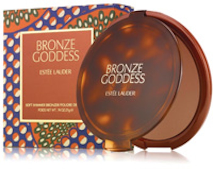
Some of the designs seen in this trend also mimic either a cultural or vintage pattern. Charlotte Ronson Summer Always has a packaging identity with a tribal pattern, with interlocking diamond shapes woven between the typography in the package design. Fresh’s Mangosteen soap has a vintage floral pattern, with a circular seal element and wire tie completing the overall traditional regal feel. And Estée Lauder’s Bronze Goddess Powder Bronzer utilizes a pattern that references 60s or 70s era textile designs with a vintage color palette.
Trend #6: Sculptural
The next grouping of products have an artistic, sculptural feel—like little works of art. And perhaps not surprisingly, all of them are in the fragrance category—and though some have been on shelves prior to 2013, there influence continues to be felt. Because fragrance has a higher price point and a longer shelf life, the package designs allow for a more intensive process involved with developing a custom component. These products also live on the customer’s dressing table after purchase, so having something that feels like a premium home accessory is important to the design, and can influence the customer’s purchase decision.
In this trend, the forms can range from expressive to simple. On the more intricate side, Thierry Mugler’s Angel has a sculpted, dynamic, angular asymmetric form with a dimensional star shape at the cap. Justin Bieber’s Girlfriend fragrance is a relatively simple oblong shape, but is enclosed by a series of overlapping expressive circle shapes in various bright colors that resemble stacked bangles. And Marc Jacobs’ Dot is a more playful take on a complex structural form, with embellishments that resemble flower petals and red and white spots that look like a ladybug.
In the packages that are more simple and minimal in nature, many have references to architecture or industrial design. Issey Miyake’s L’eau D’Issey is a tall, thin tapering triangular shape with a clean white and silver color palette to help draw attention to the form. Carolina Herrera’s 212 fragrance is a unique oblong pill-shaped design that feels clean and singular. And DKNY’s Be Delicious is also a relatively minimal form, and has an abstract shape that is reminiscent of a piece of fruit.
The design of these packages can also conjure an image of the broad concept or celebrity behind them. For example, Lady Gaga’s Fame fragrance has a relatively simple oval-shaped form at the base but with added sharp gothic inspired embellishments that reference her edgy personal brand.
Trend #7: Alternate Typography
Typography is one of the most important elements in most designs, as it usually conveys the brand name and key messaging on the most prominent panels of the package, and alternate typography—with identities that utilize handwriting-inspired letterforms, multicultural letterforms and other non-traditional letterforms—is another trend in current packaging.
Bumble & Bumble uses alternate typography at the root of its brand, with an expressive, handmade looking logo and fonts on almost all their products. In one of its newer products, Sumo Wax, the brand uses Japanese-inspired characters in a vertical configuration to create the unique packaging identity for the product. Bath & Body Works has also employed the use of alternate typography in some of its newer scents, with the Pink Chiffon and Carried Away fragrance collections both utilizing funky typography styles that feel like a handwritten note or scrapbook.
Other brands are using alternate typography with accompanying doodles to give the overall package design look even more personality. The Guerlain La Petite Robe Noire gift set has handwritten cursive typography all over the front panel, with illustrative doodles of a woman, ruffles and a building coming together in a unique design. Also, Lancôme’s Show collection by Alber Elbaz uses handmade sketchy illustration and typography to give the packaging a sense of personality while referencing the designer’s personal touch.
Following Trends Thoughtfully
As in any consumer market, beauty packaging is susceptible to trends taking place in the industry. Sometimes it’s clear that the brand is intentionally following a trend with a seasonal or limited product offering, while other times a brand’s identity falls into a trend even if the package design authentically reflects a brand’s core identity.
It’s important to remember that analyzing and understanding trends is necessary for staying current and informed, but can also be detrimental to standing out in a crowded marketplace if followed blindly. The best brands stand for a big idea and reflect the company’s personality while effectively conveying the product’s properties and benefits. Some trends can simply be fads that come and go quickly, while others endure the test of time and become visual styles with staying power. It is up to you to figure out what is best for your brand.
Aniko Hill is the creative director of The Kitchen Collaborative, which she founded with a determination to innovate the traditional creative business methodology. Her distinct creative and professional vision has produced award-winning work with quantifiable results for clients in categories including health & beauty, fashion, home products and pet care. Her work creating premium lifestyle brands for the sophisticated female market has been featured in top industry publications such as Print, CPC Packaging, and HOW magazines. Hill is also an expert editorial contributor, writing for trade publications such as GCI, Package Design and Beauty Packaging magazines. Graphic Design USA recognized Hill as one of the People to Watch in 2008.