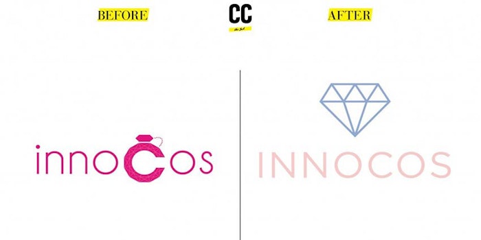
INNOCOS events recently unveiled its new logo and identity, which incorporates unisex tones and a multifaceted diamond logo. The organization recently opened up about the concept behind the redesign, offering hints toward its view of the beauty industry it serves.
The organization explained that, "New colors reflect the beauty consumer’s quest for social consciousness and wellness as well as an empowering sense of mixed identities ... We are happy to present our new brand identity powered by Creative Capital, whose vision for INNOCOS is to leverage today’s language of feminism."
The diamond prism icon, meanwhile, "serves as a literal symbol of strength. Multifaceted, changing, the diamond is a prism revealing inner beauty."
“By researching into lifestyle, fashion, art, industries we gathered a unique graphic universe called Wellness Beauty that mixes hues of blues and pinks as symbols of gender equality," said New York based Creative Capital’s Managing Partner, Tanguy Chen Laurent.
Laurent will lead an interactive workshop on how to innovate in East meets West beauty at INNOCOS Vienna on June 9th. The session will focus on innovating narratives for the creation of new brands by looking outside of beauty.


