- Being aware of fads can be critical information to a brand manager.
- To communicate eco-friendly, brands are being challenged to push themselves beyond simply using recycled paper stocks or bottles.
- Many of the products embodying the handmade identity seem to be skewed toward teen and tween markets.
- Technology-themed or -inspired identity is one of the newest trends in beauty industry, with an experiential element that creates a deeper brand experience and connection transcending the physical package.
Marketers follow and analyze trends in all touchpoints as part of their strategy work in order to determine how to best differentiate a brand. In the beauty industry, in particular, packaging plays a central role in the brand experience, and being aware of packaging identity trends can be a great indicator of industry trends as a whole. Packaging is often the first contact a consumer has with a brand, and can significantly influence purchase decisions.
Like every brand touchpoint, a package design should be an authentic expression of the company and product and should transcend current trends. Some trends come and go very quickly, while others evolve to become commonly accepted staples. Being aware of fads can be critical information to a brand manager or business owner—they may want to follow them to be perceived as current and up-to-date, or they may want to intentionally avoid them in order to stand out in the crowded marketplace.
The following examples illustrate just a handful of current beauty industry packaging identity trends taking place in 2010.
Trend #1: Rustic/Rugged
An emerging trend in the premium beauty market is a rustic or rugged packaging identity, found mostly in men’s products and in products that are composed of natural or eco-friendly ingredients. The packaging itself is not necessarily environmentally friendly or sustainable, but is used to convey casual sensibility or communicate a natural or eco-friendly product composition. This identity trend is mostly material-driven, and many of these packages have a handmade artisan feel to them and embody the brand personality of the product inside. In the men’s products, this look can also create an intentionally understated or down-to-earth presentation to differentiate from more slick or pretty female-targeted products.
Many of the rustic identity trends occur in primary packaging. In the fragrance category, the John Varvatos Artisan cologne is packaged in a glass flask wrapped in a hand-woven rattan material. The Diesel Fuel For Life cologne is housed in a weathered fabric material with loose stitching around the sides that feels like a vintage canteen. In addition to a rugged material or identity being part of the primary packaging, these rustic materials are also used in secondary packaging with a more traditional construction. In skin care, the Body Shop Hemp Heroes gift set is presented in a carton made from a material meant to resemble wicker, helping to communicate the environmentally friendly composition of the product.
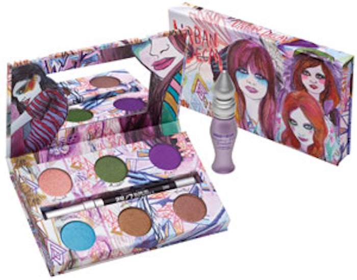
Trend #2: Handmade/Collage
Designs that are inspired by collage or scrapbooks is another recent packaging identity trend popping up in multiple beauty categories. These identities often contain bright colors, hand-drawn elements and playful typography, referencing the playful nostalgia of a teenage bedroom wall. Others are more understated, with handwriting playing a central role in the logo mark or in the packaging design graphics. The overall look of the collage-inspired trend is artsy and hip, and creates a unique personality for the product. Many of the products embodying this identity seem to be skewed toward teen and tween markets.
The technique of this trend is combining elements that may be unexpected, whether they are materials or graphic elements. The design of Sarah Jessica Parker’s NYC fragrance utilizes a juxtaposition of colorful graphic patterns to create a visual representation of expressive fabrics and references to high fashion. Many of the packages that fall within this trend also utilize illustration. Urban Decay’s Show Pony Shadow Box features the work of LA artist Kime Buzzelli, known for her paintings of fashionable women with makeup running down their cheeks. Some of these packages even mix photography and illustration for a true collage reference—the design of Smashbox’s Heartbreaker palette has photos with a graphic photo edge layered onto faux handmade doodles, with a handwriting-inspired logo mark and the word “Hot” written in what looks like a teen girl’s handwriting.
In addition to colorful and playful collage and scrapbook designs, a more simple handwriting identity approach is also seen within this trend. These products generally have a clean color palette or very little color at all—most often in simple black and white. Victoria’s Secret Beauty Rush products and the fragrance Black by Kenneth Cole both have a handwriting graphic packaging design identity with clean black, white and gray color palettes. Lush has utilized the handwriting theme as the sole visual expression of the packaging for its handmade bath and body products, which is a more literal expression of the product itself.
Trend #3: Sustainable
The general green or eco-friendly trend has been going on for several years now, but brands are being challenged to push themselves beyond simply using recycled paper stocks or bottles. Many brands are going a step further and using truly sustainable, renewable, reclaimed, biodegradable, and vegan materials and ingredients in their beauty products—and in their packaging. In this trend, many of the packages that have sustainable packaging are for products also made with environmentally and ethically responsible ingredients.
Most of the sustainable packaging identities are material-driven. For example, the Body Shop Hemp Gift Set is contained in a box made from reclaimed materials such as rubber tires. The Urban Decay Sustainable Shadow Box comes in a renewable material bamboo case, with eye shadows in a tray made of recycled paper and the recyclable clear outer PET box. The sustainability trend also applies to the products themselves—EcoTools by Alicia Silverstone utilizes renewable and vegan ingredients both in the products and the packaging. The bags are made with natural hemp material, recycled PET and nontoxic inks; the tools are made from highly sustainable bamboo handles, 100% cruelty-free bristles and recycled aluminum ferrules. For the secondary packaging, the cartons are made from 30% postconsumer recycled content and printed with nontoxic inks. Beauty brands are even receiving certification for their sustainability efforts; Cargo Plant Love, for instance, is a green line certified by Ecocert for being environmentally friendly in product, packaging and process.
Trend #4: Technological/Experiential
Technology-themed or -inspired identity is one of the newest trends in the beauty industry. With the ever-evolving nature and fast pace of technology, many brands have embraced this trend not only with their marketing efforts but with their product development and packaging identity as well. Many of the products in this trend are tied into full campaigns with social and new digital media to create a 360-degree brand experience. Sometimes the technology is in the packaging itself, or sometimes the overall design and theme is inspired by digital motifs and references. As with actual technology, there is also almost always an experiential element that creates a deeper brand experience and connection transcending the physical package.
Technology and user experience was the graphic theme for Givenchy’s Play fragrance, with the identity being inspired by the universal “play” symbol seen on MP3 and DVR players. The Play brand creates an additional user experience online, where users can register to listen to music or even create their own mixes. The technology trend in the beauty industry also involves providing a “bonus” technological device as a gimmick. For example, CK One and CK Be each have a limited edition that is packaged with a portable speaker that is compatible with MP3 players. In some instances, the technology can also be a vehicle for instruction. Stila has been on the forefront of this trend for the past couple of years; its Smoky Eye Talking Palette has a small microphone integrated into the palette that talks the user through each step in creating the look. Stila has really taken the technology trend in beauty to the extreme with the recent launch of its Makeup Player, a makeup case and kit that has a dock for an Apple iPod to play instructional videos or music.
Trend #5: Pop Culture
The entertainment business is no stranger to brand promotion, with product cameos being a part of almost every movie and TV show. With pop culture in general, the worlds of art and commerce have become blurred, and the beauty business is no exception to this rule. The trend of integrating entertainment and pop culture themes into beauty packaging is becoming common in the color cosmetics industry, where the look of character makeup and daily makeup is becoming blurred and younger markets are wanting to recreate the looks seen in their favorite movies. Marketers are taking note and building on these strong brand relationships.
In general, the vampire trend is one of the biggest in pop culture—this is being mirrored in vampire-themed beauty, where the modern vampires are more glamorous than their mid-century counterparts. Twilight seems to be the most popular vampire inspiration in the beauty industry, most likely due to the large (and lucrative) teen audience following (see “Licensing Color: Movie-inspired Makeup”).
DuWop’s new Twilight Venom and Lip Venom V are literally named for the popular vampire series Twilight, “[blending the] human and vampire worlds” with these plumping products inspired by the “fresh bitten lips” from the movie. Julie Hewett’s Twilight Palette is also based on the series, with four eye shadows that allow users to create their own vampire-inspired look. In addition to general pop culture themes, beauty brands are also creating products licensing specific entertainment franchises. Urban Decay’s Alice in Wonderland Book of Shadows (as pictured on this issue’s cover and featured in “Licensing Color: Movie-inspired Makeup”) is directly cross-promoted with Tim Burton’s new Alice in Wonderland movie, with a packaging identity directly mirroring the movie’s ad campaign and look and product names such as “White Rabbit” and “Jabberwocky.”
Trend #6: Typographic
All-typographic packaging identity solutions have been around for quite some time, but it seems that more and more brands are jumping on this look in both prestige and mass-market distribution channels. Even within their mostly simple visual design sensibility, some of these identities are a bit more playful with clever naming and large type—others have more dense information and a clean, Swiss design aesthetic.
Philosophy was one of the first brands that utilized an all-typographic packaging identity, with intentionally stark black-on-white designs, conceptual product naming such as “Hope in a Jar,” and inspirational, “philosophical” copy that reinforces the meaning of the brand name. Modern Organic Products (MOP) in hair care and Malin + Goatz in prestige skin care also follow this trend, but both use splashes of bright color to identify categories and bring a bit more energy to the design. The naming of products within this trend is often clever to bring more personality to otherwise more simple identity—Bliss’s “Fat Girl Slim” cream and True Blue Spa’s “Shea It Isn’t So” are just a couple of examples in the skin care category. This identity approach is also being seen in mass-market with a bolder typography and impactful naming. Maybelline’s “The Colossal” mascara utilized large, bold, stacked type to give the feeling of large scale—directly mirroring the product benefits. Dermalogica’s Clean Start line also utilizes a large-scale typographic packaging design, with color splashes used to delineate different products.
Trend #7: Look-specific/Instructional
The instructional trend has been around for several years, but has almost become a requirement as consumers are expecting more from their product and brand experience. Almost every brand now has an instructional or look-specific kit, with the most common look in cosmetics being the smoky eye. This trend began with prestige products, but is now also widely seen in mass retail brands. It seems that almost every brand understands the everyday woman’s need for simplicity and instruction.
In the smoky eye palettes, Benefit’s Smokin’ Eyes and Too Faced Smoky Eye Palette both are a compact palette with colors paired together and diagrammatic instruction on specifically how to create the look. The smoky eye kit is now also widely seen in mass retail brands—Sonia Kashuk for Target is now selling a “How to Create a Smokey Eye Palette” and Cover Girl has a “How to Create a Smoky Eye Look” product and tutorial kit.
Trend #8: Masculine
With the still relatively wide open market for men’s personal care, it seems that every brand is coming out with a new men’s line these days. Since this is still a relatively new category, brands seem to be playing it safe when marketing products previously thought of as “feminine” to men, which has created a sea of sameness in the packaging identity. Most of the identities are either black are dark brown, with bold type and basic design. It seems that marketers are afraid to step outside the box with men’s personal care in fear of it seeming like a “girly” product.
American Crew was one of the first brands to utilize a masculine dark brown bottle, with other companies such as Woody’s following suit. In hair care, Redken for Men and BedHead for Men both have solid black packaging with mostly white, simple typography. This packaging identity look is also the same in skin care, with Clinique for Men and Neutrogena Men both having this same exact look.
Even with the sea of sameness, there are some brands that are bucking the trend. Dove Men was recently launched with the support of recent Super Bowl campaigns. Its overall brand approach is more lifestyle-oriented, and the packaging identity strays from the typical black or dark grey look with a clean, sophisticated blue with bright accents. The packaging identity remains approachable to men without having to have the cliché look of its competitors.
Aniko Hill is the founder and creative director of The Kitchen Collaborative, a boutique branding agency that works to create premium lifestyle brands. She has worked on branding projects for Boeing, Disney, Master Foods, Sony, Ketel One Vodka and Red Bull, and has taught advanced courses on branding and packaging design at The Art Institute of California. In 2008, Graphic Design USA recognized Hill as one of its People to Watch.