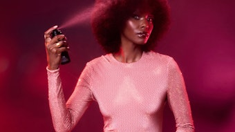
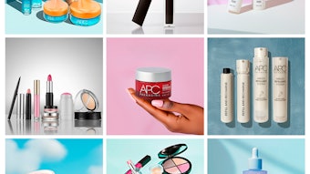
- When shopping for color cosmetics, consumers are usually looking for a specific product type and not a specific brand, underscoring the critical importance for cosmetic brands to maximize the power of good packaging.
- A successful color component must feel fantastic and handle flawlessly, as well as be beautiful, embody its brand ideals and deliver the product it contains intuitively—and be fun.
- Companies are investing in new delivery system and applicator technologies that couple effectively with today’s formula and consumer needs. The challenge is to dovetail the product type and/or delivery/applicator innovations to enhance a formula’s benefits and usage.
Color is deceptively simple yet wonderfully complex; nobody knew this better than Sir Isaac Newton. In the late 1600s, Newton deconstructed color, discovering that sunlight was actually white and that this “white” was comprised of the seven colors of the rainbow. These colors make up what we call the spectrum, and this color spectrum is actually made up of varying frequencies and wavelengths. Each color has its own designated space within the spectrum, and, to further confound us, some colors occupy more than one wavelength. In the end, Sir Isaac rightfully proposed that the colors we see aren’t “color” after all; what we see are light waves that are either refracted or absorbed by the object they are hitting. When light hits an apple, the apple absorbs all colors except for red, which is why it appears red. I could go on about varying color theories, color harmony, color context and so on, but you get the picture: deceptively simple yet wonderfully complex—and an integral part of our human experience.
Perhaps not coincidentally, color cosmetics packaging is a lot like color. When compacts, mascara or lipstick cases are designed and executed well (regardless of the distribution or cost of goods), it can be a beautiful, meaningful and lasting statement for a brand. But make no mistake, its beauty and functionality is the sum total of a myriad of small decisions, made by multiple cross-functional disciplines and painstaking attention to detail. It’s dichotomous that within the beauty arena such small packages are often the most challenging to design. Exceptional color cosmetics packaging (like color) is deceptively simple, yet as the market continues to demand innovation and brands continue to search for new ways to capture market share, cosmetics packaging is indeed becoming more complex—and more exciting—than ever before.
Category Growth Through Inspiring Packaging
Today, cosmetics are big business. According to analysts at Euromonitor International, color cosmetics trended positively in 2011, with global worldwide retail units sold reaching nearly $4.5 billion. (For more, read “The Future Bright for Color Cosmetics Despite Economic Gloom” by Euromonitor’s Rob Walker in the April 2012 edition of GCI magazine.) According to The NPD Group, nearly 800 million units were sold in both prestige and mass channels in the U.S. alone. Recently, analysts see renewed activity in the eye, lip and nail segments with innovative package forms following suit—and, in fact, all color categories are bustling with new offerings. With such strong market activity, it’s no wonder brands are pushing designers and suppliers alike to come up with inspiring packages that deliver new experiences. Yet category growth isn’t the only reason color brands are so focused on alluring packaging.
Research shows that when consumers shop for color cosmetics, they are usually looking for a specific product type—but more often than not, they don’t have a specific brand in mind. This consumer behavior should not be underestimated, as it underscores the critical importance for cosmetic brands to maximize the power of good packaging. In short, packaging is an amazing—and immediate—opportunity for brands looking to attract and hook new customers.
Within the specialty store environment, compelling packaging is often a catalyst for opening up dialogues with potential customers, which is, of course, the first step in developing a memorable brand experience. While many prestige brands already have strong market presence and a cadre of loyal followers, their devoted consumers can in fact be tempted to try something new as the result of innovative packaging that excites or intrigues them. But as in all beauty categories, the packaging had best live up to (or better yet, surpass) consumers’ expectations and reinforce the brand equity—otherwise that magical “Wow” moment will quickly slip away and the chance to connect long-term with a consumer will dissipate in an instant.
In mid-tier or mass retail distribution channels, cosmetic packaging has to work even harder, as the opportunity for a sales associate or brand ambassador to engage potential customers first-hand rarely exists. Furthermore, the shopper likely has no chance of trying the actual product, and is, therefore, reliant primarily on the packaging to form her conclusions about the brand and its products. This requires designers and brand owners to really amplify the positive attributes of their packaging in order to effectively communicate the brand’s core messages and product benefits.
Again, according to The NPD Group, innovative packaging, meaningful brand offerings and well-communicated product benefits can make all the difference at point of purchase, tipping the scales from a “Maybe” to an “I’ll try it,” regardless of sales venue. Simply put, while winning packaging is an important ingredient to a program’s success in other beauty arenas such as skin care and fragrance, it is an absolute non-negotiable in color cosmetics, and is a primary driver for capturing customer attention and potential sales.
Inspiration and the Well From Which to Draw
What aesthetic qualities make for a winning color cosmetic package? The answer depends on whom you ask—but as a designer, there is no other category quite like color in which to explore the fusion of femininity, fashion and function. A successful color component must feel fantastic and handle flawlessly. It must be beautiful, embody its brand ideals and deliver the product it contains intuitively, regardless of the cost of goods. It must at once seduce and inform, and lest we forget how closely aligned color is with fashion and color trends, it should and can be fun.
Designers pay special attention to the weight, form and acoustics of a piece. Does the shape conjure positive associations with the user? Brand DNA, ergonomics, materials, applicators and delivery systems, product evacuation and a host of other concerns are carefully weighed and considered in order to create an exceptional impression. That’s a pretty tall order for a little package, but when it’s done right, the statement can become iconic and the user experience unforgettable.
Fortunately, creative types don’t have to look very far for new technology or materials from which to draw inspiration. Today, suppliers are pushing the boundaries in order to offer brands unique and differentiating products. Companies such as HCT Packaging, 3C Inc., Albéa Packaging, Eastman Chemical and Cosmopak, as well as many others, continue to invest considerable R&D resources as they develop packages, materials or delivery systems that will ultimately help their customer’s brands stand out and address burgeoning packaging/consumer trends.
One such packaging trend is the increasing use of metallization or metallized details and decoration techniques on packages to add sparkle and perceived value to a program. HCT Packaging’s metal division is a prime example of a supplier dedicating attention and assets to this end. It produces compacts, color cosmetics components (like its patented metal tips for cosmetics), mirrors and a score of other beauty items, all in-house. This fall, the company will be launching Kevin Aucoin’s new lipstick, which is a mix of different metals and nonmetallic materials.
Metal connotes “luxe,” and brands are capitalizing on what this infers. Anomatic is another company serving the beauty industry with literally hundreds of metallic or anodized custom color options, and it too has seen an upsurge in popularity in the use and application of metallics on primary packaging.
Burberry’s new color cosmetics program takes full advantage of metallized effects, although in a subtle and sophisticated way. Made by Topline Products, the elegant line is a success story of refined manufacturing and decoration techniques, among them self-aligning magnetic closures, textured screening processes in the Burberry plaid and, yes, metallized edges on a charged plastic base. A sharp-looking program, it is made all the richer by the delicate addition of the gunmetal-colored metallization, which ultimately gives the line a wonderful glow, without being too shiny.
A nicely designed market standout also making dramatic use of metal is Guerlain’s “Rouge Automatique” lipstick, in lustrous gold. Seemingly a simple, classic lipstick case in the Guerlain tradition, this product incorporates a clever technology twist—on the outside of the case, a wonderful sliding button lifts the bullet from within. Smooth and streamlined, this design makes accessing the product all the easier and looks good while doing so.
Bridging color and skin care, Christian Dior’s Diorskin Nude Tan Glow Sun Powder is upscale and techy, and comes (appropriately) in an equally high-tech-looking silver Cannage compact that literally blings. The mini Kabuki application brush is also accented with shiny silver, lending both articles a fashion-forward, sleek persona.
More Trends and More Ways to Execute
Another package trend (albeit very different in visual impression than metallization) is clarity—the use of higher-end, clear plastics to suggest luxury in a fresh way. Eastman Chemical’s unique polymer ESTAR-CN was invented to allow designers and brand owners to produce sharp, intricate and heavy-walled designs in a crystal clear material conceived to foster creativity. I can honestly say this premium material is fun to work with, as Marc Rosen Associates and Eastman partnered with the likes of C+N Packaging, Axilone, Plasmetik Precision Molding and Jackal Cosmetics to design and execute four color cosmetic lines leveraging the material’s attributes. As a potential client remarked while holding one of the designs, “This is new luxury.”
A mix of both clear and metallized components can be found on Sephora and Pantone’s recently launched collaborative effort the “Universe Collection.” Debuting in early 2012, this limited-edition color line is built around a “Color of the Year” (in this case Tangerine Tango #17-1463), and consists of lipsticks, nail polishes, eyeliners, blushes and makeup kits. Meant to inspire playful experimentation and reinforce how color can transform face and mood, the packaging is a bright combination of clear case tops (for easy color identification) and brushes with silver bases and caps. It’s a strong, fun statement with tremendous promotional possibilities and growth potential. Maybeline’s SuperStay 24 lip products are also a great example of combining metallics and clear materials on both primary and secondary packages, for an overall impactful presence and easy line navigation.
Delivering the Goods; The Details
Of course, great packaging is more about looking nice; it needs to function effortlessly and evacuate or allow access to the product within. To this end, many companies are investing in new delivery system and applicator technologies, recognizing that in today’s competitive market, smaller details make a big difference. Not that the point-of-contact between a consumer and a product is a small detail. In fact, well-engineered delivery systems enhance the appeal of a brand and deliver the actual product experience that fuels customer excitement and future purchases.
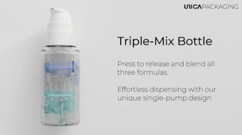
Companies such as Wormser, TaikiUSA, World Wide Packaging, the Geka Group and OEKAbeauty (to name a few) are all developing ultra-advanced delivery systems or applicators that couple effectively with today’s formula and consumer needs. The challenge is to dovetail the product type and/or delivery/applicator innovations in order to enhance a formula’s benefits and usage. Excelling at this gives a product a point-of-differentiation over the competition and infers quality, efficiency and value.
To this end, Albéa has launched a unique powder compact called Eureka, complete with sponge applicator (designed with an organically shaped handle) that allows users to replicate the cosmetic application techniques of makeup experts. It’s a striking package with major shelf appeal, and when you consider how women pat-pat-pat this type of product onto their face, the handling benefits of the sponge are quite apparent.
Sephora has a magnetic, stacking brush wand that is sleek and clever. Made by Anisa International Inc., it possesses multiple brush heads in different shapes for different looks and purposes, all neatly stacked, part n’ parcel of the wand itself. Crisp graphics let the consumer know exactly where each brush sits in the pecking order, from top to bottom. Also, the company Cosmogen has developed a line of tubes that come with a patented rotating head (to preserve formula integrity) and multifunctional applicators, providing multiple benefits with the advancement of a single component, in this case the closure.
And while not a delivery system per se but cool nonetheless, blending science and beauty would be TaikiUSA’s antimicrobial resin EcoG+. Created to allow mascara developers to reduce preservatives in their formulas (or even eliminate them) yet still maintain product efficacy, this is one innovation consumers might not be able to see but will surely appreciate as preservatives can cause eye irritation.
Creativity combined with consumer insight has always been a cornerstone in the beauty business. Without these two ingredients, truly innovative packaging or products are impossible to design and develop, let alone convincingly move into a competitive marketplace. Color cosmetics continues to grow on a global scale, not in small part to the many dedicated brands and professionals rising to the challenge of delivering unique and exceptional experiences to the consumer. Packaging that is intuitive, beautiful and enhances the user experience is now the new benchmark, and crucial for success in this category. It must look great, of course, but it must function beyond expectations, as well.
Innovation and attention to detail are fueling color cosmetics today. Be they new breakthrough products, line extensions, seasonal collections or just a fun new lipstick in a kicky color, the market demands excellence and ingenuity. With the advancement of new delivery system technologies, multitasking packages, high-tech materials, fresh deco techniques and expanding platforms with which to engage consumers, building better products was never so creative or fun for the stakeholders, and exciting for our customers.
Kevin Marshall is the vice president and group creative director of Marc Rosen Associates, an award-winning boutique design firm specializing in the beauty and luxury industries. Marshall’s responsibilities include brand vision and articulation, stewardship of client projects, package/graphic design and creative leadership. He can be reached at [email protected].