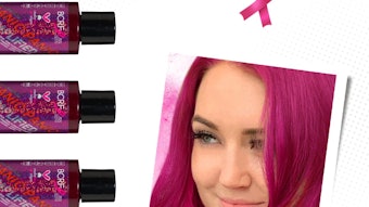
Fashion colors at various awards shows held in late 2010 and early 2011 have included a plethora of pinks, deep greens, dark blues and blacks—as well as silvery grays, corals and coppery browns. The few reds that were evident were toned down and deeper and darker than in past years.
These colors are very much in line with those included in trend analysis and color forecasting tools created by beauty industry suppliers, including Clariant Masterbatches’ ColorForward 2011. But what, if anything, do fashion trends and forecasts tell you about what color your new cosmetic packaging should be?
People, in general, tend to respond to colors that reflect the broader influences on their lives. When they are anxious, they may tend to gravitate toward colors that intrinsically make them feel calm. When they feel empowered, they reach for products that reflect that same energy in design, application and, yes, color.
For example, in the late 1960s and early ’70s, young people were concerned about war, racism and poverty, and successful protest marches and sit-ins gave them hope that their personal commitment could change the world. This gave rise to bold, bright, lively colors in everything from clothing to kitchen cabinets.
Looking Ahead
Since brand managers are working now on products and packaging that will be on the market in 2012 and beyond, they need to anticipate which colors will be most effective in gaining consumer attention a year or more from now. Again, the question arises: How can that be done?
First, there are some basic principles. The science of semiotics suggests that color, just like any sign or symbol, can have a direct effect on emotions and that each one of you responds to the stimulus of color in a certain way. People tend to be attracted by some colors and repelled or disturbed by others. The differences may arise from deep-seated personality traits, life experiences, basic desires and even subconscious mental processes.
Color can signal certain subtle differences in familiar scenes, giving you information about what you see. A lush green forest impresses you with its health and vitality, but when the same forest view is tinged with yellow, you see it as unhealthy, even if nothing else has changed. If the colors are bright orange, red and yellow, you assume you are seeing the forest in the autumn and, although you know the leaves are dying, you feel a warm, positive response. If those same colors, on the other hand, appear dull or pale, you respond to it more negatively.
In other situations, a person’s response to color may be conditioned by culture or national origin. In many parts of the world, red inspires strong feelings of excitement and danger. However, red can stir other emotions too. In China, red is all about power, prestige and happiness. Red is the color of weddings, lucky money envelopes and the Chinese New Year. Koreans, on the other hand, are unique in the world in associating red with innovation. Thus, while red evokes traditional images among Chinese, Koreans connect red to the future and technology.
These differences in perception and response are important when it comes to branding and differentiation. Using color well can contribute to or reinforce the values of a brand. A small failure, on the other hand, may cause significant damage.
What Do People Want?
Beyond the basic semiotic principles, there is another layer that needs to be considered. It is one that constantly shifts and changes as the world economy, technology, natural and man-made catastrophes, popular culture and other developments make their imprint on the psyche of consumers. What will the world want to buy in the coming year? And how will consumers decide between two similar products? These are the questions that designers and brand managers struggle with perennially.
Generally, they will try to give the market what it wants. If consumers seem hungry for technology, they can develop a product that has that digital appeal: a new touch-friendly interface for a hand-held device or a cosmetics package that slides open like a cellular phone. If customers are concerned about economic problems and possible job loss, developers can create products that allow buyers to feel sensible, responsible and conservative.
As noted, all of these emotions have allegories in color. Warm reds and golds and soft browns and grays can help consumers feel safe. Flirty pinks, lime greens and luminous orange can tap into a feeling of youthful fun. Neon blues, electric purples and shiny blacks invoke high-tech. Marry these kinds of colors with a product intended to appeal to the same sensibilities and you magnify the effect. You create a difference, if only subtle, that can prompt a shopper to choose your product instead of another even though it may be almost identical except for its color.
However, while color experts may be able to say that a mossy green or a turquoise or a coral red might tap into a consumer’s environmental consciousness, there are no guarantees. You can’t make a non-sustainable product into an earth-friendly one simply by coloring it green. But if your product is made of all natural ingredients, the minimal packaging is compostable or recyclable, and your company operates responsibly, then you could call attention to these positive attributes with colors that are drawn from the natural world.
No Easy Answers
It is easy to fall into the trap of looking for the “next hot color.” The truth is, however, that there is no such thing. There are colors that connect with certain people at certain times.
Sometimes the appeal reaches a larger demographic group than usual and it seems that “everyone” is buying or wearing the same thing. But successful colors are usually part of broader societal trends. The success or failure of a color used in a particular product or package is a result of much more than selection of the color itself. It really has to do with how well the product and the color connect with a consumer under market conditions. You can’t rely on the fact that “this particular blue” will be successful, but you may be able to predict that “a light, silvery, slightly electric blue that suggests a confluence of space, time and technology” is more likely to successfully connect with consumers who are tuned into “the blending of the human and the technological.”
Lastly, it is important to remember that consumers do not change their minds abruptly. They don’t stop responding to one shade in favor of another. Rather, color preferences, like mass social trends, tend to evolve slowly in time and over geography. That’s why no one can tell you what color to choose. The best they can do is provide information and inspiration that you can interpret and adapt to fit your own marketing objectives and product requirements.
Chris Pandis is the global head of packaging for Clariant Masterbatches, whose products are marketed under a number of global brand names—including OMNICOLOR universal color masterbatches. www.clariant.masterbatches.com; www.clariant.com
