- Typography has been around as long as print, meaning its variations are numerous, and it plays maybe the key role in communicating to consumers.
- Common typographic selections include serif, sans serif, script and alternative typefaces, which can communicate everything from tradition and elegance to rock ’n’ roll and playfulness.
- The most important thing to keep in mind when developing or rebranding a product’s packaging with a new typeface is to stay true, representative and consistent with the brand’s message.
Since the beginning of civilization, typography has been used in one form or another to document our culture and to tell stories. Up until recent history, typography was mostly an art form created by hand, from the cherished illuminated manuscripts of the Middle Ages to the custom lettering seen in mid-century advertising. It wasn’t until the invention of Gutenberg’s printing press in the 1400s—widely regarded as one of the most important events in modern history—that mass production of information and literature became possible and typography as we know it today was born.
Although food has been packaged throughout history, it wasn’t until the 1800s that products started to be labeled and marketed to the masses. By this time, typography had started to play a central role in communicating product attributes and benefits to buyers. Today, typography is part of almost every visual interaction we have with brands, whether we are reading an article online or selecting a package to buy on the shelf.
One very important principle in typography and letterform design is that a font is not a logo. A logo is a symbol for the brand, and therefore must encompass a much bigger and broader story, even if the logo does not have an accompanying pictorial mark. Because fonts are so readily available, a typeface typically needs to be customized or arranged in a unique type treatment in order to be ownable for the brand. Additionally, many larger companies even commission custom corporate fonts to be developed for them in order to make their design communications more unique.
There are thousands of different typefaces, and the vast amount of fonts available makes the specific classification characteristics of the past virtually impossible. However, it is important to have a general understanding of the basic categories of typefaces to make an educated decision about what to use to represent a beauty brand.
Serif
Serifed typefaces are comprised of letterforms with thick and thin weights and details often referred to as “feet” on many of the letters. In typographic history, they were popular much earlier than sans serif typefaces and are, therefore, often used now to communicate a sense of heritage. Serif typography is widely attributed to the stone-carved letterforms as seen in the Trajan Column (circa A.D. 113) in Rome. The serif element is said to have come from applying a brush to the stone before it was carved, which created the thick and thin effect and the feet on the ends of the letters. There are many subclassifications of serifs that can each communicate a slightly different feeling, but in general, serifs are perceived as a traditional typographic choice.
Serif fonts can be used in primary and secondary copy and are arguably the most versatile due to their legibility. For this reason, they are commonly seen as the body copy font in almost all publications.
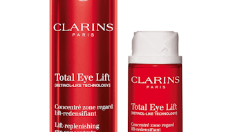
In beauty packaging, there are endless examples of typography utilizing serifed letterforms. Perricone MD uses serif letterforms both in its brand mark, in the product name, and in descriptions supported by traditional packaging components and labels for an apothecary or medical reference. Other brands also employ serif-driven typography to convey sophistication along with tradition. For example, Lancôme and Dior both utilize serifed logos and supporting typography for a straightforward, yet premium effect, and L’Occitane takes the heritage approach even further with traditional stamps, seals and materials that support the serifed typography with a nod to Old World France.
Serif typography can also reference a specific idea when used in context. For example, Philosophy’s packaging puts a conceptual twist on classic publication typography with its intentionally dense copy that mimics the style of a dictionary.
Sans Serif
A sans serif typeface is exactly as it sounds—a font without serifs. Sans serif fonts also date far back in history, although with the popularity of serifed faces they were virtually obsolete until the 20th century. Just like with serifed fonts, there are many different subclassifications, but in general, sans serif fonts are considered to be overall more clean and modern in feel. They are still easy to read but often thought to be not as legible as serifs when used in dense body copy.
Also just like with serif fonts, sans serif typefaces are very common in beauty packaging. In particular, many cosmetic companies utilize sans serif faces as both their primary and secondary typography. Smashbox and Laura Mercier both have straightforward, lowercase sans serif type treatments as their primary brand mark, and they both use clean and simple sans serif typography for their product name and descriptions. Nars uses a common sans serif typeface in its brand mark, but gives it a more unique twist with an overlapping type treatment. Skin care lines Peter Thomas Roth, Murad and Ole Henriksen are other users of sans serif typography in their labels, helping these brands to communicate a clean, modern look to consumers.
Script
Script typefaces are based on letterforms originally created with a flexible brush or pen, and they most often have varied thick and thin weights within each letter, reminiscent of handwriting. The main script subcategories are formal scripts and casual scripts, with formal scripts as generally more refined in appearance and dating back much earlier than their casual counterparts. In general, script typefaces are used to communicate a formal or elegant feeling, and tend to convey more of a feminine tone. Script fonts also are often more complicated and are therefore often much harder to read than serif or sans serif fonts, which is why they are rarely seen in the context of dense body copy.
Beauty brands use script typography for a wide range of designs that range from elegant to expressive. Many classic, premium brands such as Cartier have custom-designed script logos that are often the only element seen on a package, as seen in Cartier’s fragrance packaging. The Frederic Fekkai brand uses script letterforms in its mark as well, but also balances its logo design with cleaner serif and sans serif typefaces.
And even though their name suggests otherwise, formal script typefaces don’t always have to convey stuffy tradition. Benefit, one of most playful cosmetic brands out there, uses script typography in products such as Bad Gal Lash. When given such a twist, taking a font out of its usual context can have a fun and playful effect. Kiehl’s and Salvatore Ferragamo employ more casual script designs for their logos, which are both reminiscent of handwriting or a signature, and some brands use script designs to create a more expressive look. Bumble and Bumble, for example, uses a casual brush script for all parts of its packaging design, including the brand name, messaging and as an abstract pattern in the background.
Alternative
There are endless types of additional classifications and styles of letterforms used in typography today, from handwritten or distressed to themed or pixel fonts. Alternative letterforms are typically used to communicate a very specific tone and can often be considered novelty. In general, alternative fonts are the most difficult to work with as they can feel gimmicky if not executed correctly. With the right direction, however, they also offer a unique element for a brand, and alternative fonts are most often seen in primary, bold usage such as headlines, posters and billboards.
One example of an alternative classification is black letter, Gothic-style typefaces that were popularized in German culture. Although black letter is actually a classification in its own, today these typefaces are not used as often—and when they are, they are typically used for a rock ’n’ roll style reference. Kat Von D’s makeup and skin care line and Urban Decay both utilize black letter typography in their core identities for an edgy feel.
Also, beauty brands that want to convey a novel brand personality can utilize alternative fonts that are themed, such as how Buxom uses circus-style letterforms along with retro illustrations for a tongue-in-cheek package design. Real hand lettering or fonts that feel like they were done by hand are also widely seen—Coach Poppy, Vera Wang Lovestruck and Hanae Mori fragrances all have handwritten typography styles in their package designs for a more expressive and unique identity.
Beyond the Basics
Although typography can be complex in its tonal intricacies, the most important principle to keep in mind when selecting a font or family of fonts to represent a beauty brand is to always keep in mind the big picture message the company is trying to convey. Typography may seem simple, as we all have endless fonts at our fingertips with the recent advances in personal computing, but it is actually one of the most nuanced aspects of design and is still considered an art form even though it is not often created by hand anymore. Although a dying breed, there are many designers out there that devote their lives to designing fonts and custom letterforms.
With all this in mind, just like with any other brand asset, it’s critical to rely on an expert to best select and arrange typography to adequately express a beauty brand’s personality. Fonts, like other design elements, fall in and out of fashion over time and can appear dated if one is not aware of the trends. As a brand owner, an understanding of the basic principles of typography will be the beginning to making informed, objective choices and not personal ones when branding or rebranding a package.
Aniko Hill is the creative director of The Kitchen Collaborative, which she founded with a determination to innovate the traditional creative business methodology. Her distinct creative and professional vision has produced award-winning work with quantifiable results for clients in categories including health & beauty, fashion, home products and pet care. Her work creating premium lifestyle brands for the sophisticated female market has been featured in top industry publications such as Print, CPC Packaging, and HOW magazines. Hill is also an expert editorial contributor, writing for trade publications such as GCI, Package Design and Beauty Packaging magazines. Graphic Design USA recognized Hill as one of the People to Watch in 2008.

