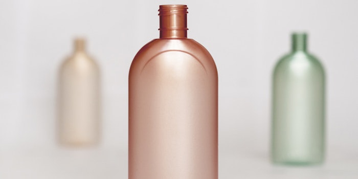
Clariant has released its new ColorForward 2021 trend palette packaging with a satin effect that is said to target the Asian personal care market. According to the company, warm colors that are in this packaging palette are associated with youthfulness and anti-aging in Asian cultures.
Further reading: Spray Frosted Boston Round Bottles by Alpha Packaging
The packaging includes three tones:
- The golden ticket, a translucent beige with gold flecks
- No Wi-Fi, a soft green
- Motus intelligentia, a warm pinkish coral
“What we found is that there is a definite preference for soft, muted colors and those that are found in nature,” said Vick Cai, designer at Clariant in a statement. “So we chose a beige and a light green, and even the red we selected is a very natural shade. Then, by adding the satin look, we create an illusion of depth within the container walls, making the bottle appear more like glass. However, the effect is not only visual. It gives the bottle a softer surface feel. It makes it more pleasurable to hold in your hand and this further heightens the impression of luxury.”