- According to a recent study, 85% of consumers attribute color as a primary reason for their purchasing behavior.
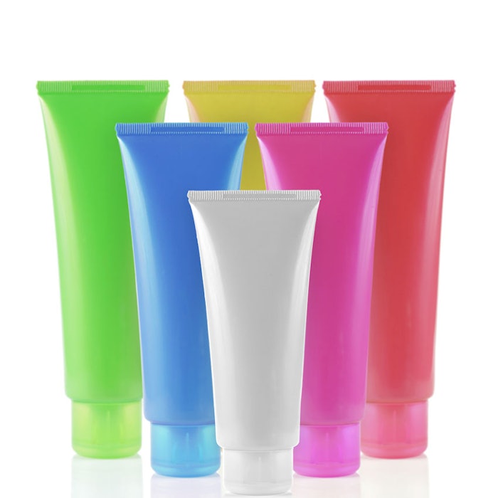
- Color in your brand’s packaging and products helps clarify and maintain the message of your branding, creating a key visual element in brand storytelling.
- Color in packaging can have practical applications, such as being used to protect formulations from light or discoloration, or even from exuding an odor.
When it comes to eye-catching packaging, color is clearly one of the most important characteristics to take into account. “A recent study found 85% of consumers attribute color as a primary reason for purchasing behavior,” notes Roseanna Roberts, director of color trends for The Color Association of the United States (CAUS).
Your beauty brand is often instantly recognizable by its color, so it’s key to choose the right ones. “The color becomes the brand, and there are many cases of this in personal care,” says Peter Prusak, head of marketing for Clariant Masterbatches North America. “A consumer can walk to the shampoo aisle and know where their favorite brand is from 20 feet away.”
The right colors can provide much more than brand identity, though, and savvy suppliers go above and beyond to deliver.
What Can Colors Do?
It’s certainly vital to make sure the colors used in a brand’s packaging are a match to the brand itself, as well as the message the brand aims to convey. However, going beyond selecting a color that matches a brand identity is a service that a supplier can provide. “We discuss color trending during the color selection process,” notes Prusak. “If the brand owner is offering a new product, we assist them with formulating colored packages that are not on the store shelves currently. Because Clariant is a global company, our color trending utilizes global trends and research.”
Moreover, certain colors can offer added value to the product beyond branding, such as protecting the product inside the container. “The pigment choices, along with opacity, can offer protection from the ultraviolet rays or the sun or store lighting, potentially extending the products shelf life,” Prusak says. “The ‘protection’ of the product from odor issue or discoloration also can be overlooked during color selection. Clariant takes these factors into consideration when working with the brand owner or specifier of color.”
Color Development
It’s equally important to ensure that what goes into the colors themselves is right for the specific package. “Colors are first developed utilizing a very extensive palette of colorants,” Prusak explains. “Each pigment, dye or special effect may have unique properties such as regulatory status, heat or light stability or color strength. We work with the brand owner to first choose the correct colorants for the requirements then match the colors based on a color standard provided by the customer.”
Sandra Huston, sales and marketing director for beauty packager Topline Products, agrees the color development process can be quite comprehensive—as it should be. “Whatever the color choice, the process of selecting the right color is not as simple as it sounds,” she notes. “Every shade and finish needs to be carefully considered before such a critical decision is made.”
In the case of Maybelline New York’s Color Elixir lip gloss package, the best solution was to actually let the color of the products speak for themselves. Topline created a package with a two-part bottle where the inner section is shaped as a lipstick bullet and color-matched perfectly to each shade. Consumers can clearly and easily see all 20 available shades, making for a likely purchase. “With its thick-walled base and anodized metal cap in shiny silver, the Maybelline package has an overall stylish look different from the norm and with excellent color impact,” says Hutson.
Also capitalizing on the true color of the product formulation, Bath & Body Works called on Anomatic to provide anodized aluminum caps to match the hues of certain shower gels, including Golden Magnolia Sun, Violet Lily Sky and Pear Blossom Air. “Anodized aluminum has a pristine look to it,” says Steve Rusch, president and CEO of Anomatic Corp. “It can be highly reflective, giving the package a more luxurious and upscale appearance. And any color is possible at Anomatic—last year alone, we anodized more than 400 custom colors.”
Setting the Tone
Whichever colors are chosen for packaging, it’s important they set the correct mood and convey the desired attributes of your brand. “We want to inspire and instill trust in our customers—and have this enhanced by the colors we choose,” says Jeroen Proos, director of Irish body and hair care brand Human + Kind. “Our products contain natural and naturally derived ingredients, so we chose green, orange and yellow [colors in our packaging]. Human + Kind will continue to use bold colors and designs to be a distinctive, fun and vibrant brand.”
Looking ahead, keep an eye on the future of color use in packaging, as improvements in technology will result in different effects. “Innovative and evolving material technologies are allowing brands to experiment more with interesting finishes and color, creating more alluring packaging,” The CAUS’ Roberts concludes. “Color will continue to be a dominant element.”
Lisa Doyle was formerly the associate editor of GCI magazine and is a freelance writer in the Chicago area. Her work has appeared in Skin Inc. magazine, Salon Today, America’s Best, Renew and Modern Salon.

