Materials, finishes, shapes, colors, typography, and imagery all play a role in creating a cohesive luxury experience. Some of these design choices are so ubiquitous that they have become canons in the luxury space.
However, for every tried and true industry canon, there is a counter trend that emerges to challenge the norm. Indeed, the most innovative trends in luxury are happening in the indie beauty space.
By no means exhaustive, the subsequent canons and trends are important for both emerging and established luxury brands to consider as they launch products or rebrand existing lines.
Package Materials and Finishes
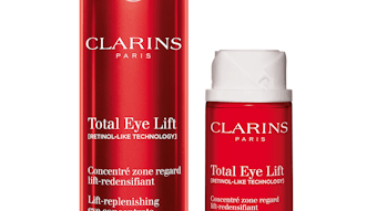
A quick perusal through the fragrance, hair care and skin care aisles at premium retailers reveals a number of visual and material cues that have become the standard in luxury packaging. Glossy metallic caps, collars and bottles dominate. The sheer amount of gold and silver is at times so prevalent that it is difficult for any one brand to stand out on the shelf. In contrast, brands that exercise restraint through a controlled use of gloss and metallic have the ability to make waves.
Restraint: Rather than cover its whole package in gold, Lisa Franklin London utilizes large expanses of white with a decisive gold accent. The L of the brand’s logo is gold and becomes the core graphic element on the package.
Another skin care brand, Amala, has packaging that is mostly white with bronze foil stamping and delicate line drawings. The controlled use of bronze, a less common metallic, with additional soft colors and cork caps, makes for a refreshing, flexible system.
Soft touch: The use of soft touch finishes to counter high gloss and metallic is another trend that we are seeing. Skin care brands Kora Organics and Nude are using soft touch to enhance the tactile quality of their packaging. There’s an approachable quality to soft touch that just makes one want to pick up and use the product. Prismologie goes one step further by foil stamping type on its soft touch tubes, creating a beautiful contrast.
Package Shape
Package shape is a powerful core brand asset, especially if using a custom mold that can be protected as intellectual property. For luxury brands, this is often essential to give you a competitive advantage. In some cases, shape can even become more identifiable than your logo.
Sleek and organic shapes: In the skin care and hair care categories, standard jars, pumps and tubes that are close to stock shapes or actual stock components are still prevalent. If investing in a custom mold, consider going far beyond standard profile shapes in order to stand out.
Crystalized/fragmented shapes: Shiseido is doing just that. In several of its serums, eye treatments and moisturizers, the brand employed curved, tapered profiles reminiscent of Brancusi sculptures. Lancôme is using a similarly tapered profile in its rehydrating toner and anti-aging serum. In both cases, the results are incredibly sleek, unexpected shapes that convey speed and performance.
On the opposite end of the shape spectrum is a brand such as Clé de Peau Beauté, which uses a highly reflective crystal shape for its limited edition cream, inspired by the decadence of the Roaring Twenties. The package is impressive, and impossible to ignore.
Similarly, Swiss brand La Prairie uses crystal shapes in its Platinum Rare cellular cream to signify a premium level. It is one of the few products priced over $1000, and the package structure clearly conveys this price difference.
Seamless package profile: Another predominant trend in the shape category is a seamless profile from bottle to cap. Giorgio Armani uses black caps and bottles in several of its creams and serums to create a sleek seamless silhouette. NARS is doing the same in several of its products across the skin and makeup categories.
Color
Color is another top brand identifier that consumers notice at retail. The canon for traditional luxury brands is an abundance of gold and silver, along with white, black and rich jewel tones.
Muted and pastel tones: When conveying luxury, it is best to stay away from strong, potentially garish colors such as primaries and fluorescents. However, there is a trend toward pastels and muted tones—pinks, lavenders, peaches and minty greens, often paired with black type. Premium skin care brand Cosmedicine is employing this color palette, combining it with touches of metallic for an added punch.
Gradients: Soft gradients are also in vogue. Japanese bath and body product brand Sai-sei uses a beautiful teal to white gradient that dissipates as you go up the tube. The result is a look that evokes hydration, which is the core benefit of the product. Skin care brand Tatcha is using the same color gradient in several of its moisturizers.
Ultra Transparency
In the luxury space, transparency and colored glass is canon, especially for fragrance and skin care brands. There’s something authentically elegant and honest about seeing the formulation inside.
Taking this a few steps further, there is a movement of using transparent bottles and placing the raw hero ingredient inside. Several indie bath and body brands, and even established brands such as Nars, are using this method. The ingredient, usually a flower, appears to be suspended in the liquid, creating a magical effect. A good example of this technique is Nars’ Monoï Body Glow II Beauty Oil.
Typography
Typography has an inherent voice without saying a word. Traditionally, luxury brands have used serif and ornate script typefaces, often adding extra embellishments to convey refined classicism. These typefaces are safe choices that have stood the test of time.
Sans serif: Newer brands are redefining the typographic language of luxury with sans-serif typefaces and simplified compositions. Brands such as La Prairie, Prismologie and Herbivore Botanicals are using sans serif typefaces similarly—as all caps with generous tracking and abundant space, yielding an airy, sophisticated look.
Whitespace:In order to achieve this, it is vital to simplify your copy to the absolute essentials across all applications. This starts on your packaging, with simple product names and benefits. Don’t over-explain. Instead, be provocative and create intrigue with smart naming and copy writing. Remember, in most cases, the only elements on your primary package are the logo, product name and required information. Your typography is doing all the work, so it must be on point.
Imagery
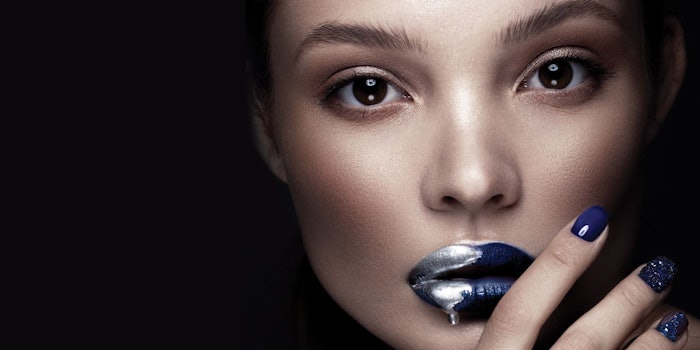
Imagery plays a big role in creating the luxury experience online, in-store and in print collateral. The canon is to use highly stylized, surrealistic and dramatic photographic techniques, offering consumers an escapist experience.These images are the result of highly produced photo shoots, used in seasonal campaigns, advertising and core website pages.
Consistent image treatments:In this age of Instagram and Snapchat, luxury brands must be generating new content daily in order to engage with their followers. For this everyday social imagery, we are seeing brands develop unique photo treatments using consistent filters, background colors or lighting techniques to create a unified feel. These treatments not only allow companies to assert a distinct point of view, but also to establish easy brand recall among their followers.
Finding the Opportunity
To a certain extent, brands must be aware and adhere to the canons of luxury branding in order to compete and cater to customer expectations. However, companies that are truly innovating are redefining what luxury means by starting new trends that go against the grain. There is still plenty of opportunity and untapped potential in the market. Find and seize the relevant visual opportunities in your product category, and your brand will be poised for success.
______________________________
Sheri L Koetting ([email protected]) is the co-founder and chief strategist of MSLK, a marketing and design agency based in New York. MSLK specializes in helping beauty brands find their voice in today’s crowded marketplace through 360° brand positioning—from overall brand strategy to brand identity, packaging, retail experience, websites and social media campaigns.