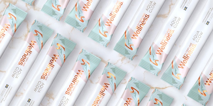
Oriflame Cosmetics partnered with design agency Butterfly Cannon for the launch of Wellness Aqua Glow.
The collaboration focused on the position and design of Aqua Glow, a beauty drink containing Ceramosides and lingonberries. The drink, developed by Swedish chemists, is meant to “complement skin care routines and improve hydration from the inside out.”
According to Butterfly Cannon, the design was created to position Aqua Glow an aspirational and Instagrammable lifestyle brand that would sit comfortably in skin care and beauty aisles. The pack’s architecture reflects this approach with centralized branding and a minimal, pared-back, Scandinavian aesthetic.
The details:
- The Wellness by Oriflame logo was retained for recognition and foiling it in rose gold is meant to bring premium and quality cues.
- Geometric facets on the pack are meant to reflect the science behind the product.
- The packaging features soft hues and uncoated, subtly flecked stock to convey the Swedish-inspired ingredients such as lingonberry.
- One of the packaging’s rippling, foiled patterns is meant to allude to the product name and convenient delivery system of dissolving into water.
According to the agency, the result is a design that delivers in-the-hand and on-screen; appealing strongly to online influencers, as evidenced by its coverage on Instagram.
In addition to the packaging design, Butterfly Cannon supported the launch of Wellness Aqua Glow with a 360° activation plan that was developed using its aspirational positioning and design elements across beauty and lifestyle magazines. This plan was reportedly a key component in the brand’s social media launch.