- Alternative shapes is one of the newer trends in beauty packaging.
- The trend to utilize the unique and distinct visual style of Japan as the brand identity results in package designs that are bold, fun and unapologetically cute.
- The ongoing rock ‘n’ roll trend has been skewing more dark and gothic in appearance and tone.
- Novelty shapes and packaging concepts, a staple of collectible or limited edition packages, is being seen in permanent collections and products.
- The use of strong industrial influences as the packaging identity is particularly prevalent in men’s products.
Beauty, like most industries, is in a constant state of flux with the identity of its brands. Most companies rebrand to accommodate a shift in their company culture or product lineup, or simply to stay current. In this process, trends can develop that spread across an entire industry. Some of these trends, such as the movement toward sustainability, follow a broader cultural shift that can be seen across multiple categories. Others, such as packaging structures, are more specific to the beauty industry alone. Some trends can simply be fads that come and go quickly, while others endure the test of time and become styles with staying power. Trends can be visual, message-oriented, tactile, or related to the nature of the product itself.
One of the best places to study brand trends in the beauty industry is in packaging. Packaging is often the first contact a consumer has with a brand, and can, therefore, greatly influence purchase decisions. This is why beauty companies tend to invest more in packaging than other brand touch points. For the beauty brand owners, following trends doesn’t necessarily mean adapting their product offerings or marketing strategies to follow them. In fact, a company may want to avoid trends to avoid getting lost in the marketplace. When embarking on establishing a brand or rebranding an existing company, it is critical to survey what the competition is doing to best differentiate your brand look and feel.
When researching the trends of 2011, there was a lot of repetition of 2010 and 2009 trends, explored in previous GCI magazine features.
Some of the same trends are still taking place, but this feature focuses on categories not previously explored. The following represents a survey of notable packaging identity trends currently in the marketplace:
Trend #1: Geometric/Deconstructed Shapes
Alternative shapes, in both primary and secondary packaging, is one of the newer trends in beauty packaging. Many of these packaging identities are nontraditional in form, and have characteristics such as severe angles, geometric forms or deconstructed approaches to the form of the package. Many of the examples in this trend category are the packaging equivalent to a Frank Gehry building in architecture.
In some packages within this trend, both symmetrical and asymmetrical geometric forms are utilized in the primary packaging to give the component visual interest. L’Occitane’s Cherry Blossom Body Lotion and Shower Gel are packaged in an asymmetrical, multipaneled bottle—creating a split front panel where package messaging is divided. This trend is also seen in secondary packaging in nontraditional cartons; the home fragrance category has been utilizing unique carton structures for quite some time. In beauty, both Aveda’s Massage Oils and Benefit’s Girl Meets Pearl have a hexagonal multi-panel carton to accommodate a round primary package inside.
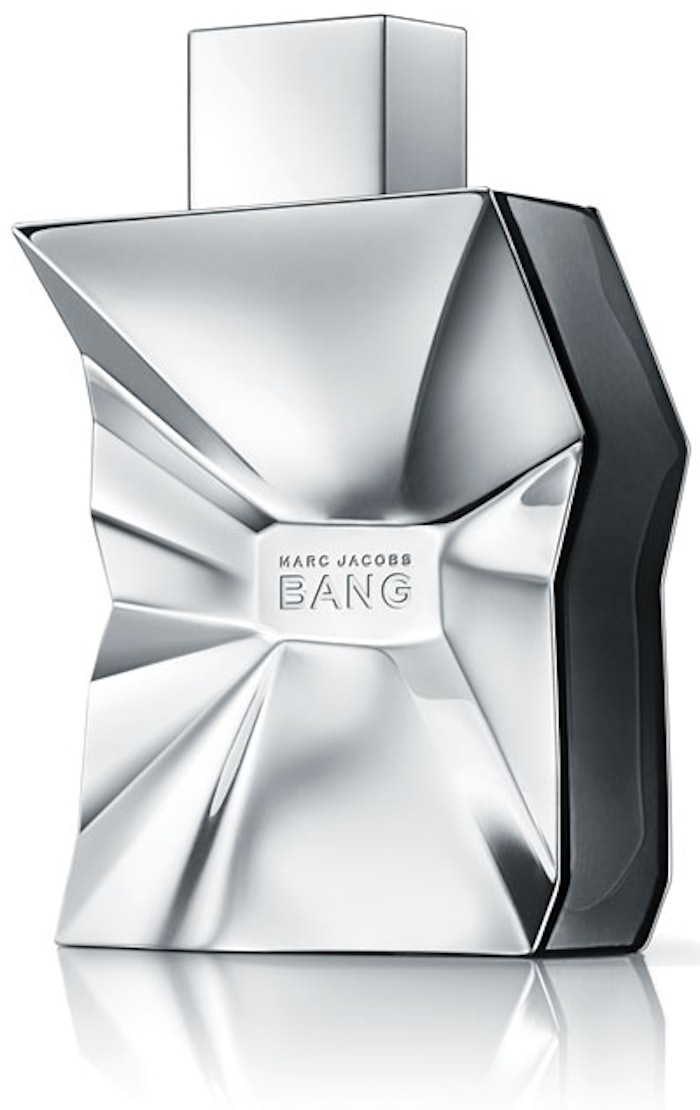
In this trend, alternative shapes are also taken one step further with the use of deconstructed shapes. In these examples, the form is intentionally interrupted or damaged for an overall edgy look or to enhance the meaning of the product name. This trend is more prominent in the fragrance category, where it is typical to invest more in a proprietary bottle shape. Many instances of these deconstructed shapes are seen in men’s fragrance packaging—for example, Bang by Marc Jacobs fragrance actually looks like a smashed piece of industrial metal, which is a clever reference to the product name. Thierry Mugler’s A*MEN Sunessence fragrance has a deep emboss of a multifaceted representation of the asymmetrical brand mark that appears to be “carved” out of the glass bottle.
From the front angle, this technique makes the package look as though the glass has been broken or that a piece of the bottle is missing.
Multipaneled shapes also appear in forms that are not deconstructed in nature—for example, in Emporio Armani’s Diamonds fragrance, the chiseled effect of the glass and the panels are a pretty representation of the cuts in a diamond.
Trend #2: Japanese
Japanese culture has been incredibly trendy in America for quite some time, and many lifestyle and beauty brands have been popping up that utilize the unique and distinct visual style of Japan as their brand identity. These package designs are bold, fun and unapologetically cute. The identities are often driven by Anime-inspired cartoons; bright, unexpected colors; and high-contrast graphics.
Harajuku Lovers, the clothing line founded by rocker and fashion icon Gwen Stefani, is an example of a U.S. brand celebrating everything about Japanese culture. The fragrance line identity utilizes cute Anime-inspired representations of girls as the primary packaging form; the secondary packaging graphics combine puffy letterforms, a bright color palette and high-contrast patterns for a fun identity with lots of personality. Tokidoki is another example of a U.S. brand with a heavy Japanese aesthetic, with a more collage like approach to the identity that is a little more edgy and dark in tone.
The aforementioned brands are built around Japanese culture and aesthetic, but in other instances, a specialty product or limited edition package takes on a Japanese-inspired identity for a novelty feel. For example, Tarina Tarantino’s Tokyo Hardcore Fashion collection utilizes a bright lime-yellow primary color, stylized illustration of a girl and Japanese characters as part of the packaging identity.
Trend #3: Gothic
Rock ‘n’ roll has been a trend going on in the beauty industry for several years, and lately the identities have been skewing more dark and gothic in appearance and tone. The heavy use of black, gothic typefaces and edgy punk rock-inspired embellishments are all characteristics of identities in this trend. The gothic packaging identity is generally utilized when a product or brand is intentionally portrayed as edgier or darker than its competitors.
Most notably, tattoo artist from hit reality show LA Ink Kat Von D’s partnership with Sephora has made the darker, edgier aesthetic in the beauty industry more widespread. For example, the Adora fragrance has a black bottle, red gothic letterforms, and an ornate silver embellishment around the neck for an overall dark, bold and mysterious feel. In other examples, the gothic aesthetic is part of a sub brand or product. The fragrance Love Rocks from Victoria’s Secret has a bold red bottle with black gothic lettering, scalloped edges and a traditional pump to communicate an edgy rock ‘n’ roll aesthetic.
Juicy Couture’s Eau de Parfum and Urban Decay’s The Black Palette are other examples of traditional brands utilizing strong gothic brand identities as the primary visual communication in these products through the use of gothic letterforms. In addition to typography, many of these gothic beauty identities also have embellishments to hint at a connection to a rock ‘n’ roll lifestyle. For instance, OPI’s Rocker Chic nail polish set has graphic representations of punk rock rivets printed onto the carton for visual dimension.
Trend #4: Pop Culture
The connection between beauty and pop culture has been growing significantly as the lines between marketing and entertainment are becoming more and more blurred. The trend of fusing entertainment and pop culture themes into beauty packaging is becoming a staple in the color cosmetics industry, with popular television shows and movies serving as inspiration for beauty products and resulting in licensing relationships. [For more on these relationships, read “Licensing in Color: Movie-inspired Makeup” at www.GCImagazine.com or in the April 2010 print issue of GCI magazine.]
The vampire trend has been building steam for the past few years and seems to be going strong, with the Twilight brand still leading the pack with teen and tween audiences. In addition to the many brands that have licensed the name in the past few years, Twilight Beauty has recently launched a line of products with detailed collections titled around specific vampire-inspired looks and names such as Luna Twilight and Volturi Twilight.
Movies and television shows with a strong makeup narrative are also growing in popularity as a way for fans to connect to the looks and characters explored in the stories. Smashbox’s Burlesque kit is inspired by the showy looks in the 2010 movie with Cher and Christina Aguilera. OPI’s Glee nail polish set is an example of a television show tie-in, with a product offering broad enough to have staying power as long as the hit show maintains its popularity. Even television networks are hopping on this bandwagon. E! network is already known for its emphasis on celebrity culture, and has launched a line of Red Carpet collections that allow the user to achieve the look of her favorite star as seen in popular awards show coverage.
Trend #5: Novelty
Novelty shapes and packaging concepts is another recent trend in beauty. This trend has been seen for quite some time in collectible or limited edition packages, but more recently it is being seen in permanent collections and products. Most of the packages categorized in this trend have some kind of gimmick to either the product shape or the packaging technique itself to create a distinct visual brand identity. A tongue-in-cheek approach is often taken in brands with this packaging identity to draw attention to the uniqueness of the company or product.
Many of the identities in this trend combine ordinary objects or elements that don’t normally go together for a clever twist, giving the brand a sense of whimsy. Benefit Cosmetics is probably best known for its unique brand, with retro graphics, fun product names and clever copy as components of its packaging identity. The Some Kind-A Gorgeous foundation has a round component decorated to look like a record, juxtaposing two objects that would normally not go together for a visual twist.
Other packages in this trend have unique, fun shapes as the primary packaging. Diesel’s Only The Brave men’s fragrance bottle is in the shape of a pounding fist, communicating the bold, dynamic scent as described in its messaging. Esteé Lauder Pleasures fragrance has a limited edition version of its package in the form of a detailed golden bird. In both these examples, the products are more prominently displayed in a user’s lifestyle (ie: on a nightstand), which warrants a more unique and sculptural approach similar to any other home accessories.
Although most of the identities in this category deal with shape and form, there are also techniques in the production of the package itself that can make it feel novel. These can include printing techniques such as die cuts, stamps and other embellishments that enhance the story or communicate a cute or funny message. For example, Sexy Little Things from Victoria’s Secret utilizes a hologram image on the front of the fragrance carton so that when rotated, it appears as if the model on the front is blowing a kiss.
Trend #6: Tropical/Beach
Many current examples of beauty brands utilize tropical-inspired packaging identities to communicate a lifestyle or scent of the product inside. Some of these identities are seasonal or have to do with the scent inside, while others communicate a beach-centric lifestyle in general. These packaging identities typically include bold, bright colors, tropical flowers and fruits and environmental references such as palm trees or beaches.
Pacifica is an example of a brand that uses a tropical-inspired look for its entire line—with bold, rich colors and large illustrative representations of the scents and ingredients inside. Bath & Body Works recently launched its Island Escape Signature Collection, with tropical names such as Fiji, Hawaii and Bali. The packaging identity for this line utilizes island-inspired typography, bold color and painterly representations of tropical flowers.
In addition to portraying tropical flowers and fruits, these identities also portray the beach both graphically and photographically. Beach Sexy, a Victoria’s Secret line, references the beach in an abstract manner, with a hot pink primary color, a blue band at the bottom representing the ocean and a golden gradation that resembles a sunset. The Michael Kors Palm Beach fragrance packaging is a fairly literal representation of beach culture, with a vintage illustration of a beach and palm trees and a nod to fashion resort wear.
Trend #7: ’60s Era
Earlier decades are constantly coming in and out of style when it comes to fashion, and beauty is no stranger to this principle. The look of the 1960s seems to be widespread across many packaging identities in the beauty industry. These packaging identities can include organic forms, funky and offbeat colors, rounded shapes, psychedelic patterns and ’60s era typography.
This connection between beauty and fashion is perhaps best demonstrated with the Emilio Pucci brand, whose funky, loud patterns are synonymous with ’60s style. The iconic patterns and colors are carried over to the identity of the fragrance collection in the signature graphics and the organic, funky, flowing component shapes. Prada’s fragrance also utilizes a ’60s-meets-art nouveau technique in the rendering of the botanical illustration in the background, with funky colors reminiscent of a Woodstock era music poster. Jean Paul Gaultier’s Limited-Edition Classique Summer Natural spray combines ’60s era font and handmade-looking decoration on the signature figure form to create a funky, retro feel. A much more subtle reference to the ’60s can be seen in Clinique’s Happy gift set, which utilizes geometric graphic comprised of concentric circles similar to patterns seen in the ’60s era.
Trend #8: Logo Pattern
The logo pattern is another fashion trend that has been seen in premium luxury fashion brands for decades, but is more recently being used as the primary identity for beauty packaging. Not surprisingly, many of the brands within this identity have roots in fashion.
Coach and Gucci fragrances both feature the signature logo patterns seen in their clothing prints as their primary and secondary packaging identities. Carolina Herrara’s fragrance has a stylistic pattern of the “CH” letterforms originally found in the logo mark as part of its primary and secondary packaging. Although most of the packages in this trend are based on typographic patterns, signature branding can be done with more subtlety. For example, Burberry’s fragrance packaging doesn’t even have the brand name on the bottle graphics—the signature plaid pattern alone identifies the package to the brand instantaneously.
Trend #9: Industrial
Another recent trend, particularly in men’s products, is using strong industrial influences as the packaging identity. These packages can allude to industrial elements and objects in form, material or embellishments, and can also have a novelty effect. The overall feeling of brands within this packaging trend is cold, masculine, and often mechanical, with many of these packages produced in a silver color and stainless steel finish.
Some of the packages in this trend have a functional element inspired by industrial elements. For example, Prada’s Infusion d’Iris fragrance has a stainless steel spray component with a chain link embellishment and hook reminiscent of an industrial chain that can be clipped to the inside of a purse or key ring.
The John Varvatos Fragrance for Men 10th Anniversary Edition package has an all-metal, silver bottle with a matching silver dog tag embellishment hanging around the neck as a keepsake.
While some of the products within this trend take inspiration from industrial elements, some take actual industrial objects out of context to create a unique package. Cartier’s Roadster eau de toilette is literally modeled after an auto part of its namesake, with stainless steel hardware and an overall retro styling. Jean Paul Gaultier’s Le Male eau de toilette fragrance comes in a package that actually looks like a tin can, a common American industrial form.
Although many of these packages are more tough and masculine in feel, the industrial trend can also take on more of an elegant form. For example, La Prairie’s Silver Rain fragrance has a unique, pointed, asymmetrical design with a stainless steel finish to mimic a droplet shape.
Aniko Hill is the creative director of The Kitchen Collaborative, which she founded with a determination to innovate the traditional creative business methodology. Her distinct creative and professional vision has produced award-winning work with quantifiable results for clients in categories including health & beauty, fashion, home products and pet care. Her work creating premium lifestyle brands for the sophisticated female market has been featured in top industry publications such as Print, CPC Packaging, and HOW magazines. Hill is also an expert editorial contributor, writing for trade publications such as GCI, Package Design and Beauty Packaging magazines. Graphic Design USA recognized Hill as one of the People to Watch in 2008.
