Season after season, Pantone Color Institute reports on leading color trends impacting all design industries, particularly cosmetics.
The colors in the palette for Spring 2016 "serve as vehicles that transport wearers to more tranquil, mindful environs, which encourage relaxation first, followed by curiosity and exploration," according to the Pantone Color Institute.
"Colors this season transport us to a happier, sunnier place where we feel free to express a wittier version of our real selves," says Leatrice Eiseman, executive director, Pantone Color Institute.
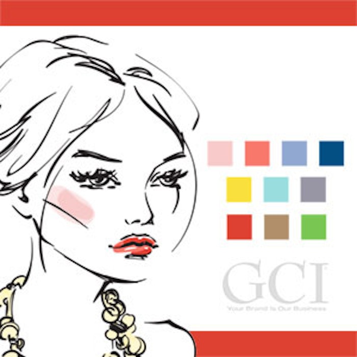
The colors in this season's palette transcend cultural and gender norms where there are no distinctions between the men's and women's collections. Read on for the top 10 colors for men's and women's fashion for Spring 2016. (Note: This information is courtesy of Pantone Color Institute.)
Rose Quartz
Rose Quartz (PANTONE 13-1520) leads the spring collection with a "persuasive yet gentle tone that conveys compassion and a sense of composure."
Peach Echo
Peach Echo (PANTONE 16-1548) is an orange toned shade that "emanates friendlier qualities, evoking warmth and accessibility."
Serenity
Serenity (PANTONE 15-3919), a transcendent blue shade "provides us with a naturally connected sense of space" — reminiscent of the sky.
Snorkel Blue
Snorkel Blue (PANTONE 19-4049) is an energetic form of navy: "the name alone implies a relaxing vacation and encourages escape."
Buttercup
Buttercup (PANTONE 12-0752) acts as a contrast from many other colors in the palette, revealing "a shining beacon, transporting its wearer to a happier, sunnier place."
Limpet Shell
Limpet Shell (PANTONE 13-4810), an aqua-green shade, is influenced by clarity and freshness, evoking "a deliberate, mindful tranquility."
Lilac Gray
Lilac Gray (PANTONE 16-3905) acts as a needed neutral in the palette. The subtle lilac undertone "adds a distinctive edge to this classic gray shade."
Fiesta
Fiesta (PANTONE 17-1564) is a strong and fiery, yellow-based red and provides "a stark contrast to the calming softer nature of this season's palette."
Iced Coffee
Iced Coffee (PANTONE 15-1040) is the second neutral in the bunch, creating a stable foundation with a natural earthy quality.
Green Flash
Green Flash (PANTONE 15-0146) is "representative of nature's persistent influence even in urban environments." Pantone describes the shade being able to combine with the rest of the palette in "unexpected, but serendipitous ways."


