A brand’s logo is the first impression for consumers, and can draw them in in just a few seconds. Above all, a logo is the number-one opportunity to convey a brand’s story and feel, which gives this mark some serious value. The treatment of colors, shapes, symbols and words packed into a logo create possibly the most enduring imprint of a business. It is important to ask yourself if your logo is conveying the right message.
1. Color
More than 90% of consumers consider visual appearance over feel or smell while shopping. This makes sense, as color is one of the first things that the human brain notices; 80% of all visual information in the brain is related to colora. Because we are such sight-driven beings, color plays a bigger role in branding than many may realize. Especially in the COVID-19 world, color and visuals become more important, as our opportunity to touch and smell a product pre-purchase is less common.
Color psychology examines how color affects human emotions or behavior. One can see it at work with an exciting yellow “checkout” button online, not only catching the shopper’s eye but reminding them of the thrill they get when placing an order. The color or colors that are used in a design can add up, conveying anything from audience age and gender to the overall company point of view. For example, a color can be timely, trendy and youthful or it can be used to represent a product that is calming and soothing, or fast-acting and efficaciousb.
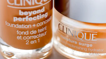
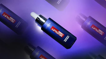
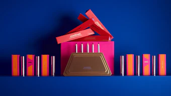
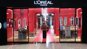
The basics of color psychology can be addressed on the color wheel. Red is a color that communicates urgency, boldness or intensity. Orange can depict warmth, zest and fun. Yellow is a great color for energy, life, optimism and cheerfulness—depending on the shade. Green is often used to depict something earthy and natural, but the color can also make someone feel peaceful and relaxed. Similarly, blue is a popular color for balance and tranquility, but it also gives a sense of security and trustworthiness. Pink and purple are both often used in a space of creativity or youthfulness. White feels clean and pure, and black conveys power, elegance and sophisticationc,d.
For the full article, check out Global Cosmetic Industry's April 2021 digital magazine.