Approximately 94% of customers are more likely to opt for a brand that they feel is genuinely transparent. It shouldn’t be shocking that brands across industries are becoming more transparent with their prospective customers as a result.
Some companies approach this trend by interacting directly on social media or releasing company messaging such as apologetic press releases or tweets that makes them seem more open and easy-to-reach. Something that gets overlooked, however, is the importance of a label.
A label can be a consumer’s very first interaction with a new brand, so it sets the tone of the entire experience. After all, first impressions make lasting impressions. Brands should leverage their labels by carefully considering elements such as imagery, typography and strategic language to attract these transparency-seeking shoppers.
Minimalist Imagery Evokes Transparency
One of the trends that has been resonating with consumers is clean and simple graphic design imagery. For instance, Frontier Label’s 2018 Labeling Trends Report, a four-month analysis of label designs from more than 1,200 companies in the craft beer, wine, food, health and beauty industries, noted that, “Simple and clean label designs that will appear most frequently on health and beauty products, due to an increased focus on transparent and natural branding.”
Often, there are associations with specific images.
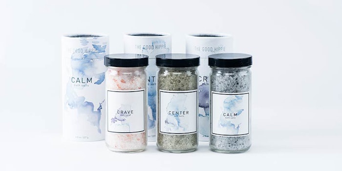
One example would be our client, The Good Hippie, which uses a simple square with light water coloring for labels on their glass products.
Simplistic images can speak louder and tell more of a story than a busy and overly complex image. Think of outlines such as trees, hearts or leaves, and simple shapes like rings or triangular shapes.
Often, there are associations with specific images. For example, a leaf on a foundation label may translate to a consumer as being an organic product without even needing wording. Looking at trends like this and incorporating them into imagery is a quick way to show a brand’s values while appealing to consumer needs.
Simple and Brand-consistent Typography
Writing, another important element to visual collateral, can actually evoke specific emotions in a viewer, as shown by Mikael Cho’s 2017 analysis, “The science behind fonts (and how they make you feel).”
To illustrate, Helvetica is often correlated with the government and tax forms, while thicker fonts such as Impact are seen as untrustworthy. This is important to note, since typography goes beyond utilizing what is aesthetically attractive and can serve a further marketing purpose.
REDBUDSUDS and its messaging work so well because, from first glance, a shopper knows the values of the company, without a lot of jargon that could conflate the message.
Consider the message being sent through imagery. Is there an organic-indicating leaf juxtaposed with a large Impact font? If so, the organic messaging may get lost or perceived as fraudulent because the visuals aren’t consistent.
Instead, opt for fonts that are curved, but simple; a very common example of this would be Arial in the sans serif family. These won’t seem as buttoned-up as a Times New Roman, but also won’t fall into the untrustworthiness trap a Chalkboard font may evoke.
There is a distinct line between typography and product for another of Frontier Label’s clients, Waxing Kara. Its Sweet Lips, a natural and USDA organic lip balm, uses simple, clean lines with few frills, mimicking exactly what the product is—simple.
Words Matter
Last, but certainly not least, is language. After solidifying imagery and typography, it’s important to make sure written aspects are consistent and in line with values.
Take REDBUDSUDS, for example. The bath and body brand focuses on doing more with less, being clean, using trustworthy ingredients and benefiting the planet. To conjure this ethos in a minimalistic way, the brand incorporates the language, “A thoughtfully clean shower bar” right on the packaging. REDBUDSUDS and its messaging work so well because, from first glance, a shopper knows the values of the company, without a lot of jargon that could conflate the message.
While some companies focus on big messaging and campaigns, they can often meet a consumer’s needs by labeling right on the product they are selling.
Don’t list out an entire mission statement on a bottle or box. Instead, make what goes into the product known and ensure the customer is fully aware of what he/she is buying. For example, if your lipstick is vegan friendly, include that information. Similarly, if your concealer is all-natural, speak to that fact!
A lot of work goes into creating a successful cosmetics line, yet marketing that line to increasingly aware consumers may prove difficult. While some companies focus on big messaging and campaigns, they can often meet a consumer’s needs by labeling right on the product they are selling.
Therefore, the key to a beautiful product that communicates openness demands a label mélange of simple imagery, clean typography and transparent language.
Jared Powell is a principal at Frontier Label, a producer of custom labels and stickers.