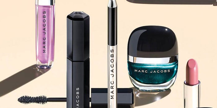
When Sephora was gearing up for its biggest beauty launch ever—900 doors in 22 countries—for Marc Jacobs Beauty, the retailer sought to have its packaging feel like an Apple product, filled with subtle details.
Sam O’Donhaue, the partner/founder/creative director at Established New York, interpreted this mission by delivering key elements, such as a hyper-thin frame for a curved compact case with mirror.
The design expert contrasted this project with another for H&M during the recent Cosmopack New York International Business Forum & Exhibition, which featured a selection of Italian beauty supply chain companies and more than 150 buyers coming from the United States, Canada, Chile, Brazil, Mexico, Guatemala and Peru.
To add fun to the sophistication, the packaging developed by O’Donhaue included fun touches like complexion sticks in deodorant shapes and lip pens that were crayon-shaped.
Proportion Play
The design project infused “juicy” shapes and products that looked like candy, foundations that looked like pills and elegant lipsticks in a posh nude case, pushing the brand toward the border of credibility and fun. The overall design concept moved Marc Jacobs Beauty toward prestige and away from the young feel of offerings like Lola.
Small Touches
To add fun to the sophistication, the packaging developed by O’Donhaue included fun touches like complexion sticks in deodorant shapes and lip pens that were crayon-shaped. All of this, of course, relied on execution, which requires creative leaders to be heavily involved with engineers, approving every element.
The results included hexagonal mascaras and relaunches of products in different case colors, like white and blue. This was backed up by the brand’s campaigns and Sephora’s in-store experience, which included unique fixtures and furniture in designated spaces, as well as small touches like offering shoppers black macarons.
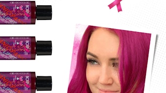
The products also featured fashion photography on pack, with some feeling more serious and others more playful.
Conversely, O’Donhaue worked on a project for H&M’s beauty products, which had struggled under a redesign that included iterations that were deemed to be “too fun.”
Most of the designs were too loud, O’Donhaue said, adding that if the brand was seen as “too fun” it risked losing credibility. What H&M wanted was a prestige feel, million-dollar look and low cost.
Not so easy.
Overcoming Limitations
O’Donhaue explained that controlling costs meant the inclusion of many stock components and just a handful of custom pieces to make them special. As a result, the design team used classic, prestige finishes—gold, ivory and black—to lend credibility. Every compact was presented in half-and-half (i.e., gold and black) to create some fun with stock elements that suddenly felt customized.
The products also featured fashion photography on pack, with some feeling more serious and others more playful. In the end, O’Donhaue said it was important to have respect for the engineering to understand what was possible. He added, however, that it is sometimes necessary to push engineers out of their comfort zones in order to truly push boundaries.