It used to be that trends originated almost exclusively from famous people, entertainers, celebrities, or fashion icons. While these are still very strong influences, color trend-setting today is definitely a two-way street.
With social media and the Internet making fresh ideas and images global in minutes, trends that originate with individuals in Barcelona, Tokyo or New York can carry originality and creativity from the real world to the runway and stage.
In this blended real-time world of high and low fashion, Impact Colors foresees 2013 and beyond as an arresting time of contradiction—contradiction in the influencers of trends and contradictions in the way color will be used to enhance beauty and individuality.
Classical Colors—Trendy and Cool
Red and black—the timeless standards for color cosmetics—will always be part of the color pallet in any season or year. But different and additional things will continue to happen; interpretations will not be standard.
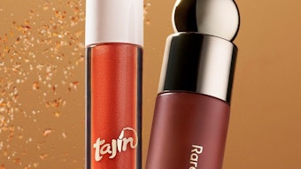
Certainly bright, deep beautiful red lips will be here. But we will also see red in unexpected places, for example in eye shadow and eyeliner. Seek out deep, chromatic blue-reds to mix with pearlescent pigments to create deep metallic reds, an important differentiation in the red theme.
Black, the long-time standard for eyeliner and mascara and new natural classic for nails, also will develop further. Standard blacks can be differentiated with small particles of silver gray synthetic mica for a daytime effect that is silvery, yet not outright shiny. Impact Colors introduced a new fancy black for glamorous evening effects by adding a quarter part larger particle snowy white synthetic mica, creating sparkle without dimming the depth and richness of the black.
Dark blue is back for the eye area. With jeans and dark blue showing up in fashion, and black slowing down a bit, anticipate dark blue for nails as this old classic becomes new again.
Formulators and beauty brands who can be create and innovate in the limited, but classic field of red, black, and deep, deep blue can be winners in 2013.
Vivid Colors and Metallics—Contradictory Themes Synchronized
Really bright colors have been important for a while now, and we see them everywhere, especially in nail varnish. But after so much exposure, bright colors can seem a little flat.
Blending a pearlescent accent of the same color adds dimension, deepening an orange, yellow or green. Pearlescence is an exciting way to supplement vivid colors with an extra gloss that adds to the punch without diminishing the pop.
The contradiction comes in when bright colors and patterns in fashion are paired with unexpected metallic accents in eye shadows and liners or nails. Copper, which hasn’t been seen for a long time in interiors or fashion, is going to come to the front, creating elegant effects with orange, a copper-red feeling that goes along with other bright colors, too. And copper provides very rich, warm highlighter that is good for lashes, nails, lips, cheek, and skin, creating a sophisticated freedom for all styles.
Impact Colors also has used intense small-particle gold from the synthetic mica-based Fiesta Colors line to produce a rich yellow that is wonderful for darker skin. A larger particle violet with shine and glitter blends into an eye shadow that is fitting for women of all ages, from cool to classical.
Toned Down Colors—Made Mysterious with White
Toned down colors are a little bit like natural colors were before, but in a more romantic way. They are a little bit muted, but fresher than muted. The shades are not pastel or natural; the secret is using white to brighten and mute. Experiment with a soft white with light pearlescent effects to create colors that invite touch. The whole appearance is much, much lighter than previously—smoky, fresh and mysterious.
Color Craze
This is an exciting time to be a formulator and a beauty brand owner in our industry. Now is the time to imagine the possibilities of glamorous pigments and eye-catching special effects colors used in adventuresome ways.
Doug Thornley is co-founder of Impact Colors, Inc. of Newark, Delaware. The company presents Color Trends 2013, a multimedia, flash drive presentation of color in the cosmetic and personal care industry for 2013. Color Trends 2013 was jointly developed by Impact Colors and Antoinette van den Berg, an internationally recognized expert in color and fashion trend forecasting and the creator of Future-Touch, a trend and product forecasting studio specializing in the cosmetic sector.

![According to the Personal Care Products Council, 'Between 1990 and 2022, the [U.S.] personal care products industry generated a trade surplus every year, reaching $2.6 billion in 2022...'](https://img.gcimagazine.com/mindful/allured/workspaces/default/uploads/2025/08/adobestock-353393403.MryFiCWzOJ.jpg?auto=format%2Ccompress&fit=crop&h=191&q=70&w=340)
