“Find out who you are and do it on purpose.”
Words to live by from Dolly Parton. Proudly larger than life, her over-the-top style is matched only by her commitment to career and philanthropy (her children’s literacy project recently sent out its 100 millionth free book). But what does this have to do with the beauty industry?
It’s about standing out from the crowd. There are plenty of talented singer-songwriters, plenty of larger-than-life blondes, plenty of humorous, wise women, plenty of philanthropists. But there’s only one Dolly, combining them all into one irresistible package.
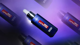
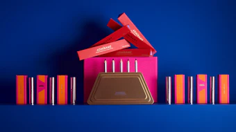
And that’s precisely what great brand design needs to deliver today: an utterly distinctive package in the broadest possible sense. Gone are the days when some pretty packaging and occasional print ads cut the mustard.
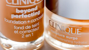
Unfortunately, looking at the typically crowded drugstore beauty shelf in 2019, we find a sea of black, white and pink, with a dash of silver and gold. Even the most tactile of velvet-touch lipstick bullets with a satisfyingly heavy click is virtually indistinguishable among hundreds of thumbnail images.
In order to be truly distinctive, beauty brand design has to stand out in every single channel. That means brands considering exactly how they look, feel, sound, smell and behave, in an utterly consistent way.
Want to read the full article? Check out the May 2019 digital edition of Global Cosmetic Industry magazine.
.png?auto=format%2Ccompress&q=70&w=80)